
Architecture is one of the few disciplines through which a culture reveals what it values before it has found the language to explain it. A wall, a threshold, a room held in shadow, a courtyard open to sky - these are never neutral acts. They speak of protection, ritual and belonging. Often, it is only by leaving home that one begins to see more clearly what kind of architecture that home might require.

Not Modern, Ancient
Architecture is one of the few disciplines through which a culture reveals what it values before it has found the language to explain it. A wall, a threshold, a room held in shadow, a courtyard open to sky - these are never neutral acts. They speak of protection, ritual and belonging. Often, it is only by leaving home that one begins to see more clearly what kind of architecture that home might require.
Returning to Europe, especially to cities as culturally dense as Milan and Paris, does not answer the question of Australian architecture, but it does sharpen it. Distance clarifies what is inherited, what is assumed, and what has settled into view without being properly examined. Looking back towards Australia from here, what comes into focus is the question our work has been trying to approach.
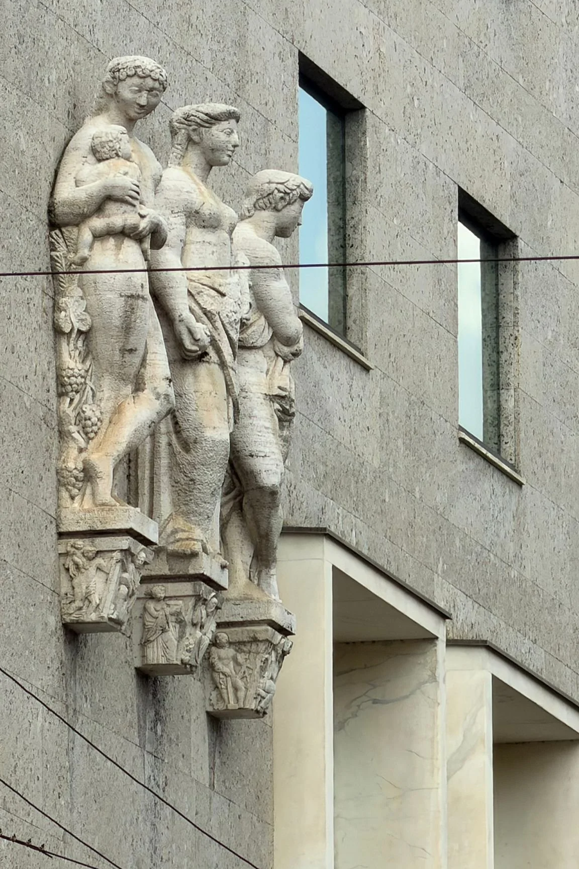
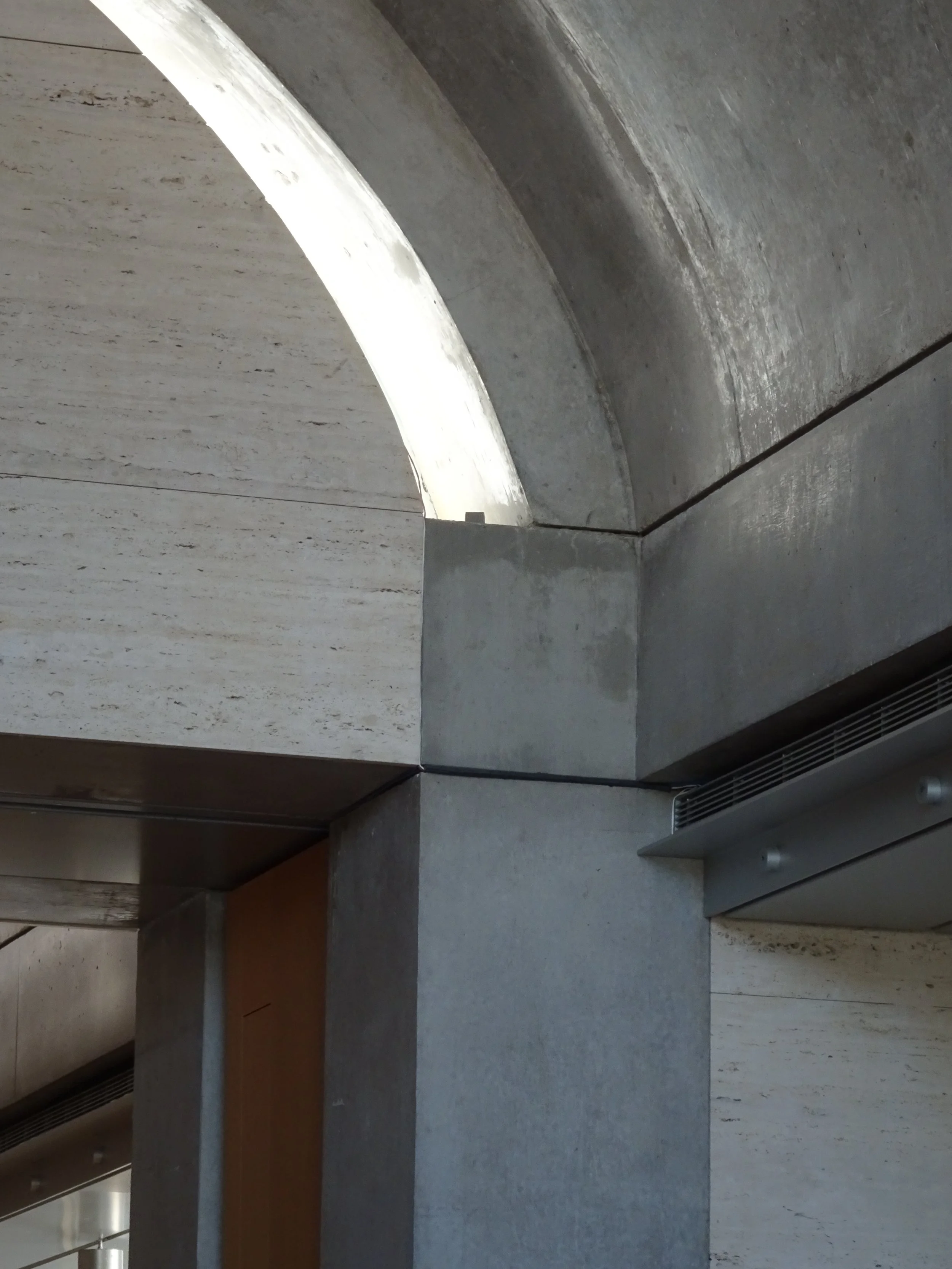
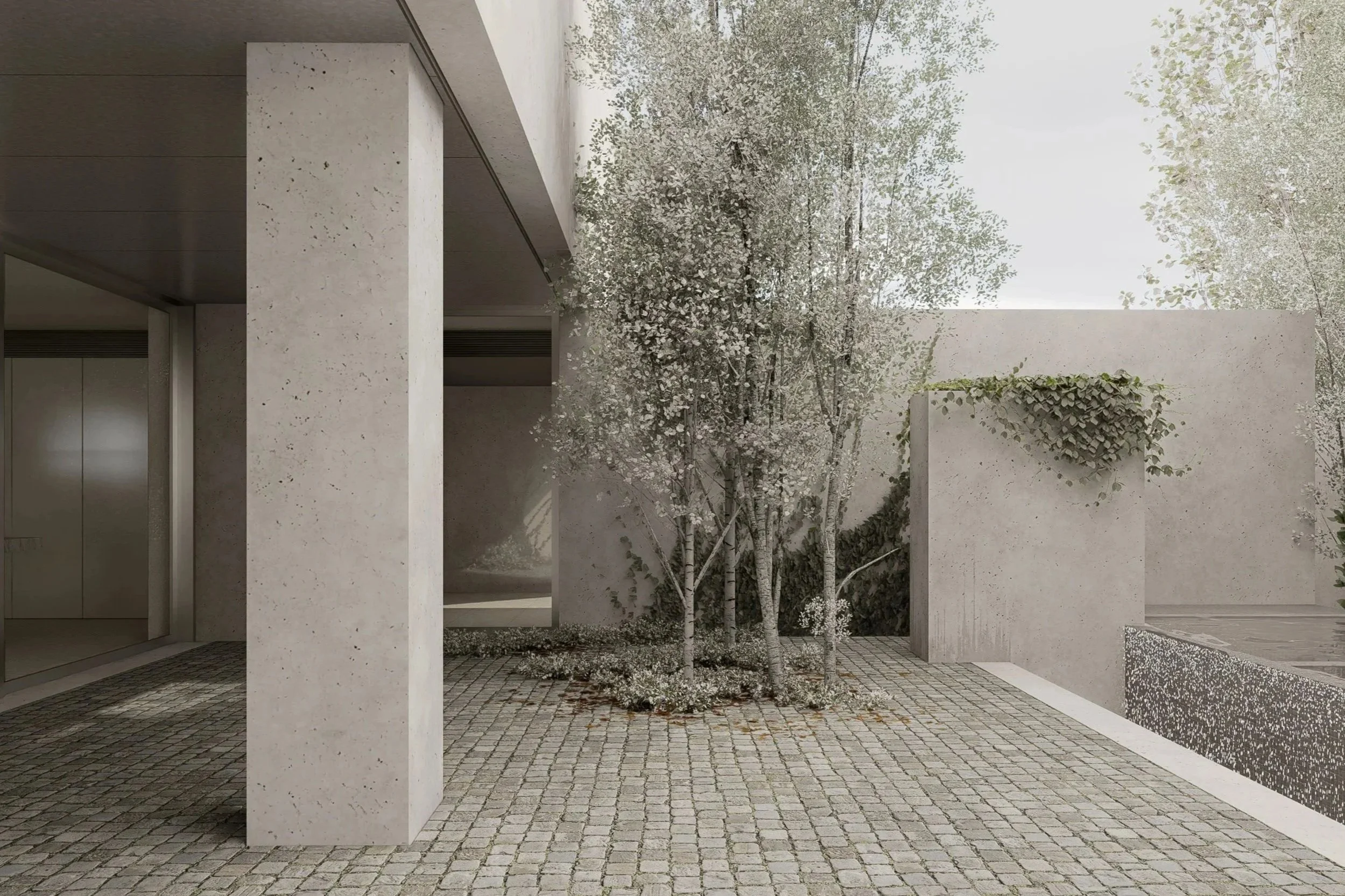
Walking past the Castello in Milan, it was not the monument itself, nor its ornament, that held my attention. It was the depth of the parapets, the weight of the walls and the darkness of the reveals. In those moments I found myself recalling the ruins of Caracalla in Rome, where civilisation appears not in its finished or triumphant state, but as residue. As husk, echo and remnant. Something once complete and emblematic, now stripped back to its essential condition.
There is something revealing in that state. When grandeur falls away, architecture becomes easier to read. Ornament disappears and symbols weaken, yet silhouette, proportion, mass, aperture and space remain. The essential things endure, and in their stripped state they feel both familiar and raw.
This matters to us because it clarifies something we have long been reaching towards. The forms that persist in our work are rarely complicated: a wall, a courtyard, an entry, a chimney, a marker in the landscape. They are not quotations from history or gestures of style, but primary figures, recognised almost before they are named. They carry an echo not because they belong to one culture, but because they sit deeper than style, within a more instinctive reading of space.
Perhaps that response is not only cultural, but biological. Human beings are hardwired to understand certain spatial conditions: prospect and refuge, threshold and enclosure, shadow and light, protection and exposure. These are things we know before language. Long before architecture became image, it was shelter. Long before it became style, it was boundary, opening, procession and room.
This is what we mean when we speak about the primal. We are not interested in primitive imagery, reduction as aesthetic exercise, or modernity stripped back once more. Our work is not trying to be modern. It is trying to be ancient.
By ancient, we do not mean historical imitation, borrowed Roman language or nostalgia for ruin. We mean something prior to style: an architecture shaped by first principles, by shelter before expression, mass before image and threshold before spectacle.
It is a way of building that can create calm, security, warmth and social ease through space itself.
In Australia, that search carries a particular weight. For those of us shaped by a Western inheritance yet practising on this ground, the question of architectural identity is not straightforward. The colonial frame no longer feels sufficient, yet inheritance cannot simply be discarded, nor can one claim a position that is not one’s own. For a non-Indigenous practice, this requires humility and care. It asks for an architecture less dependent on imported cultural codes and more attentive to place, climate, settlement and human need.
This is not a political proposition so much as an architectural one. It is a reflection on how we want to practise here, in Australia, with seriousness and respect. Rather than inventing a symbolic language, we are interested in returning to elemental spatial truths. In architecture that can be understood through the body. In work that offers security in the fullest sense: physical protection, emotional calm, clear orientation, healthy social encounter and the feeling of being held.
This is why depth matters. Why thick boundaries, controlled entry, protected courtyards, legible procession and heavy silhouette can carry such force. These are not merely compositional devices. They shape behaviour, settle the nervous system, and create the conditions for warmth, encounter, retreat and belonging. Before anything is placed within a room, the architecture itself can begin to establish comfort and compassion.
Looking back at Australia from Europe, what becomes clearer is not that one culture is richer and another poorer. It is that architecture here must often work harder to create depth, memory and security through space itself, without leaning on centuries of inherited form. That may be why we are drawn to a certain restraint. Not because less is fashionable, but because what matters most is what remains when everything extraneous falls away.
What remains is the part that resonates: the familiar but raw silhouette, the wall that shelters, the opening that gathers light, the courtyard that holds silence, the threshold that marks transition. These are the enduring elements. They do not belong to one age alone, but to architecture in its most fundamental state. Perhaps that is why ruins move us so deeply. They do not represent the past in full. They reveal what architecture still is after image, ornament and certainty have disappeared. They expose the primary act beneath the finished work.
For us, that is not a reference to copy, but a reminder of where to begin: not with style, novelty or modernity, but with the ancient idea that architecture exists first to hold life, to protect it, and to give it form.
Related reading: Travel as Architectural Education & The Comfort of Mass

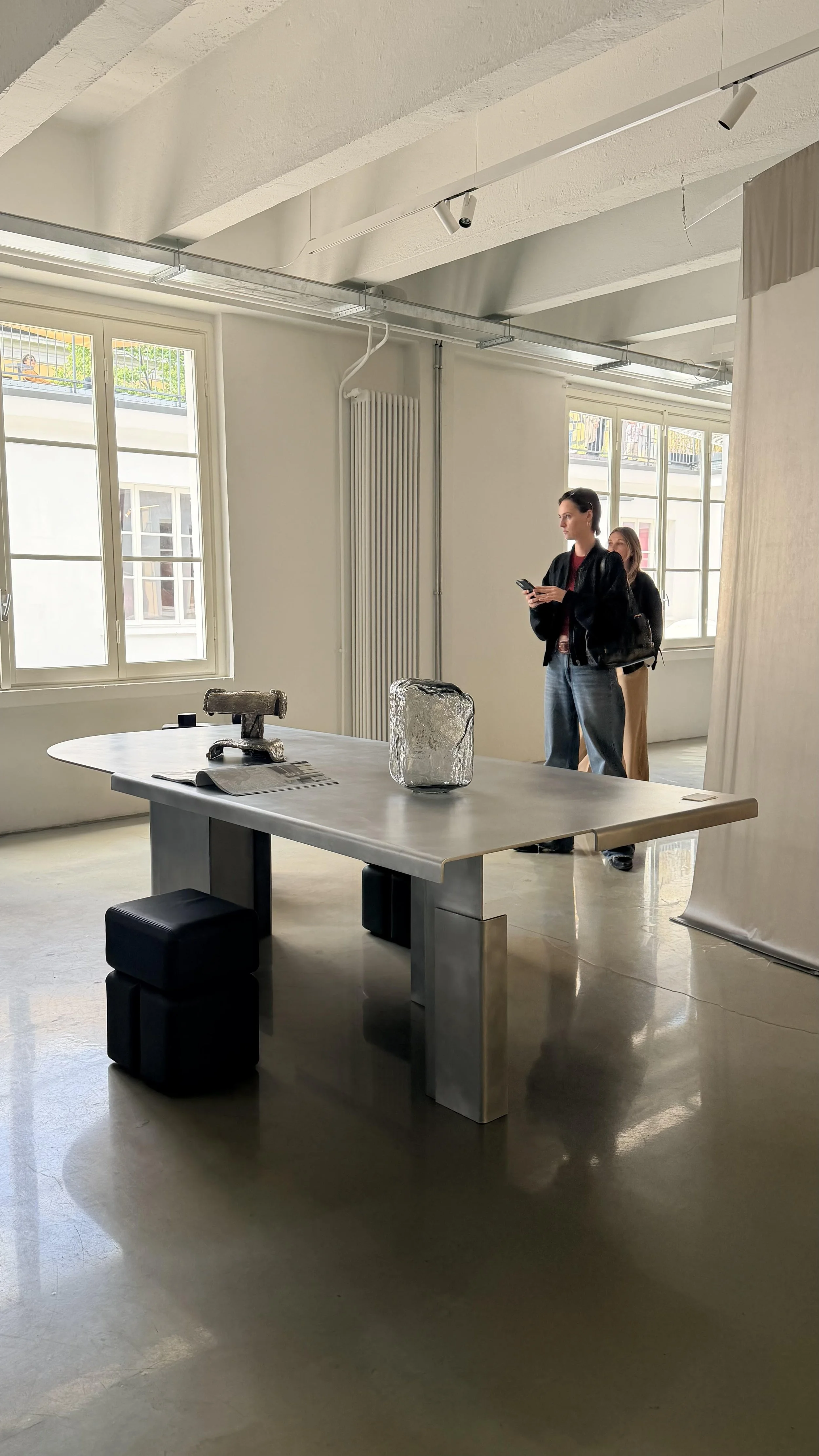
Milan Design Week can make inspiration feel almost excessive. There is so much to see, and so much designed to be seen, that the act of choosing a highlight becomes less about objective judgement and more about recognition. You see what you are ready to see, actively and passively. Certain works stay with you because they speak to questions already forming in your own practice.

The Comfort of Mass
Milan Design Week can make inspiration feel almost excessive. There is so much to see, and so much designed to be seen, that the act of choosing a highlight becomes less about objective judgement and more about recognition. You see what you are ready to see, actively and passively. Certain works stay with you because they speak to questions already forming in your own practice.
For me, Linde Freya Tangelder’s Fluid Re-Collection was one of those moments.
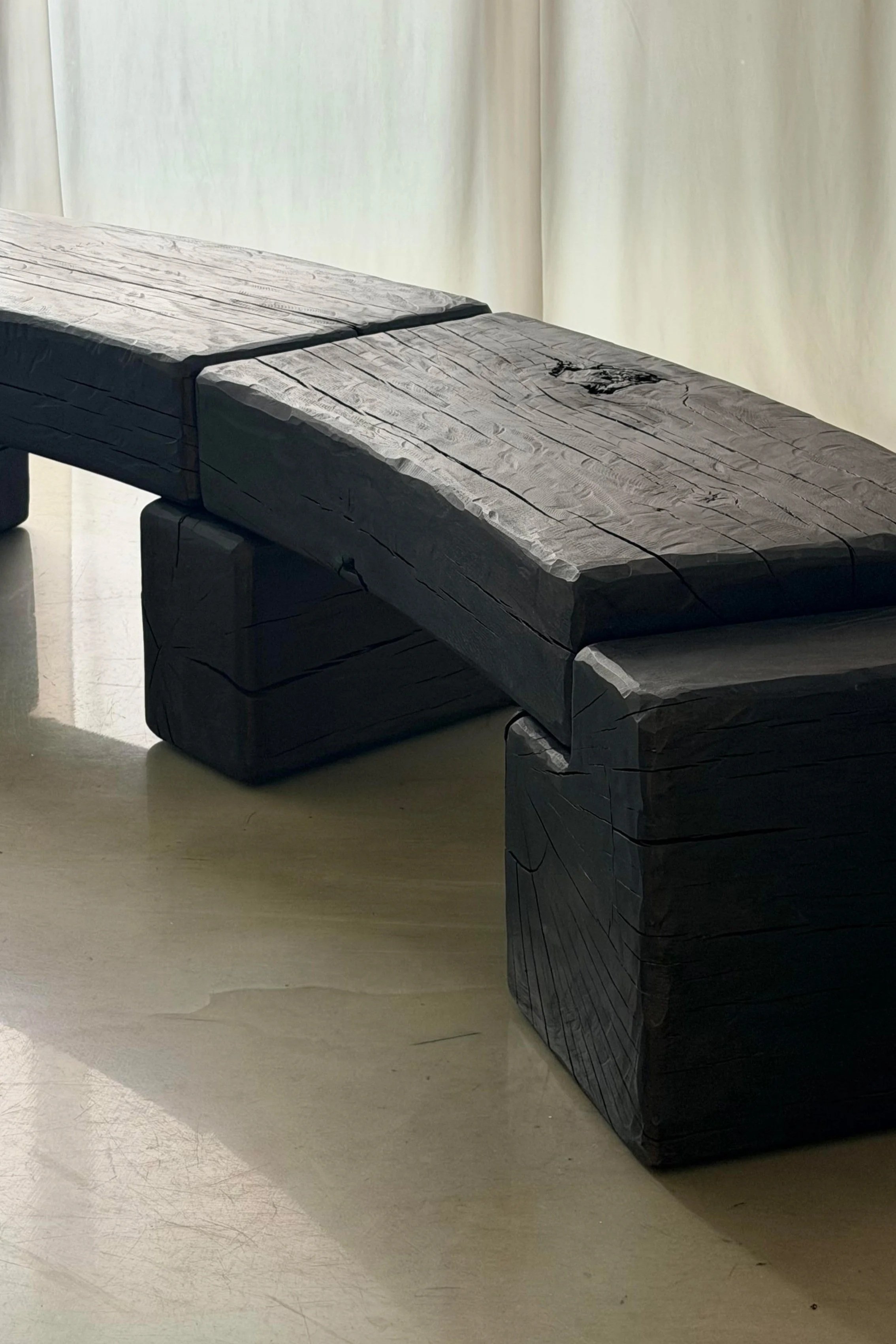
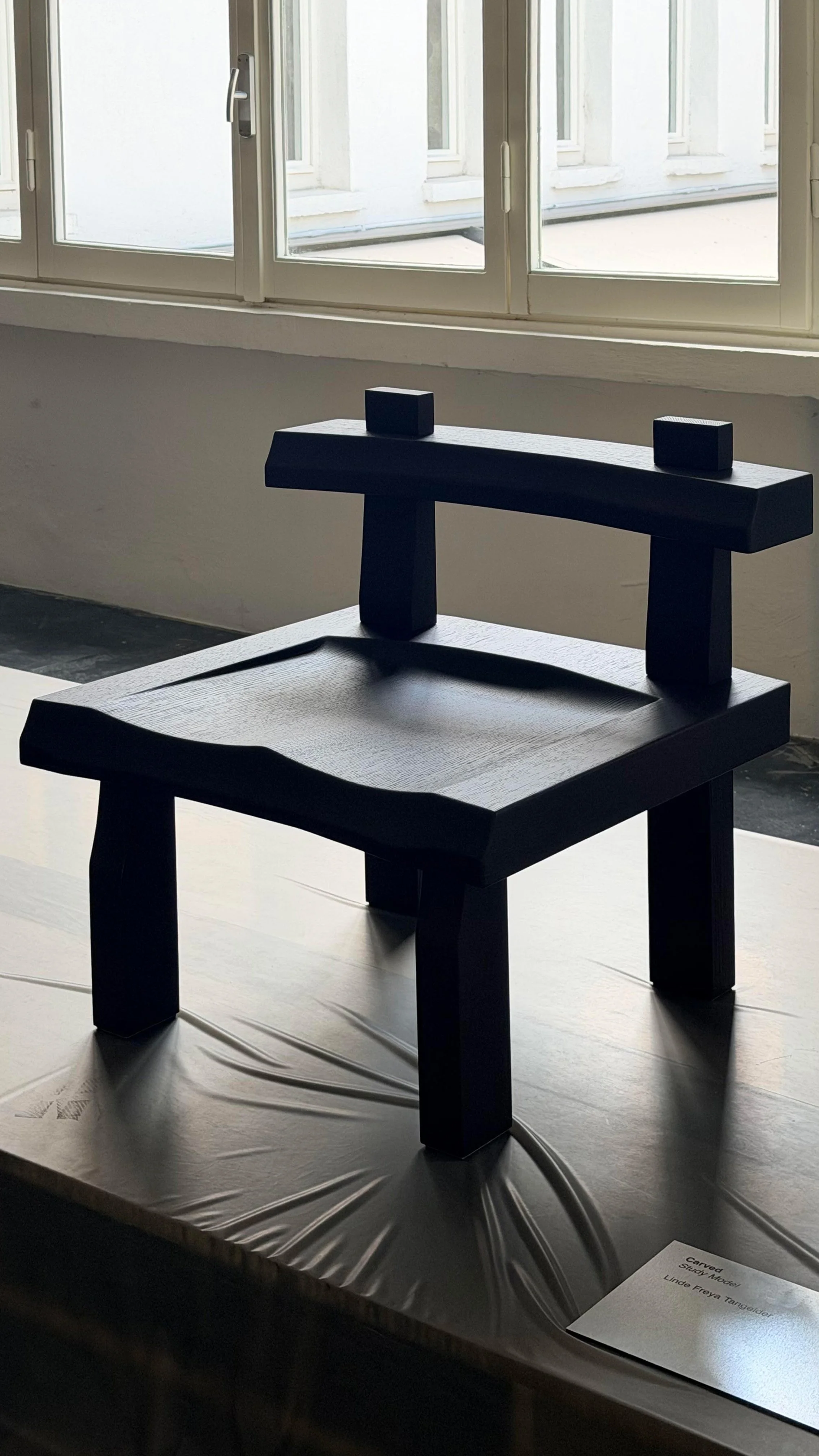
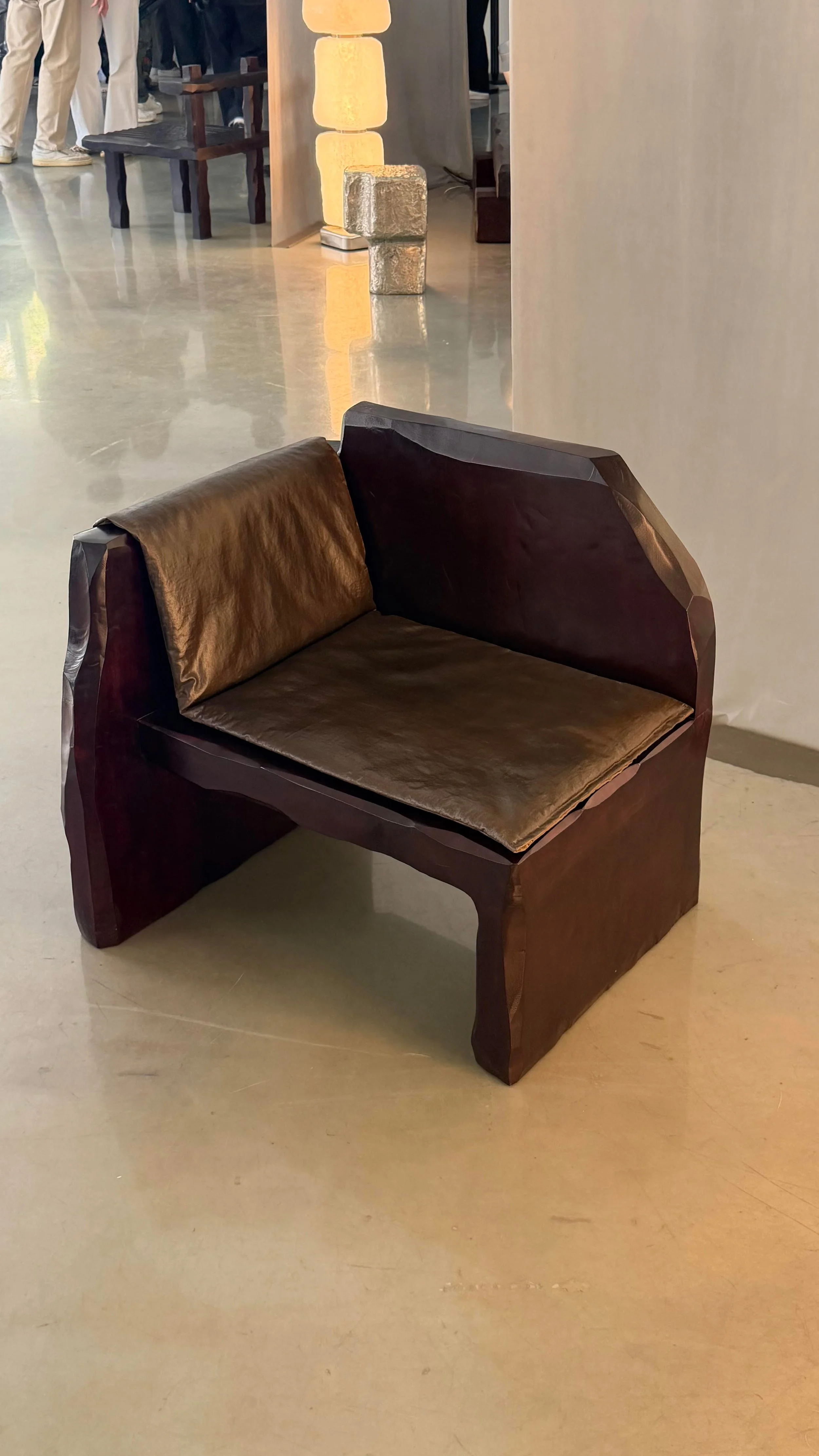
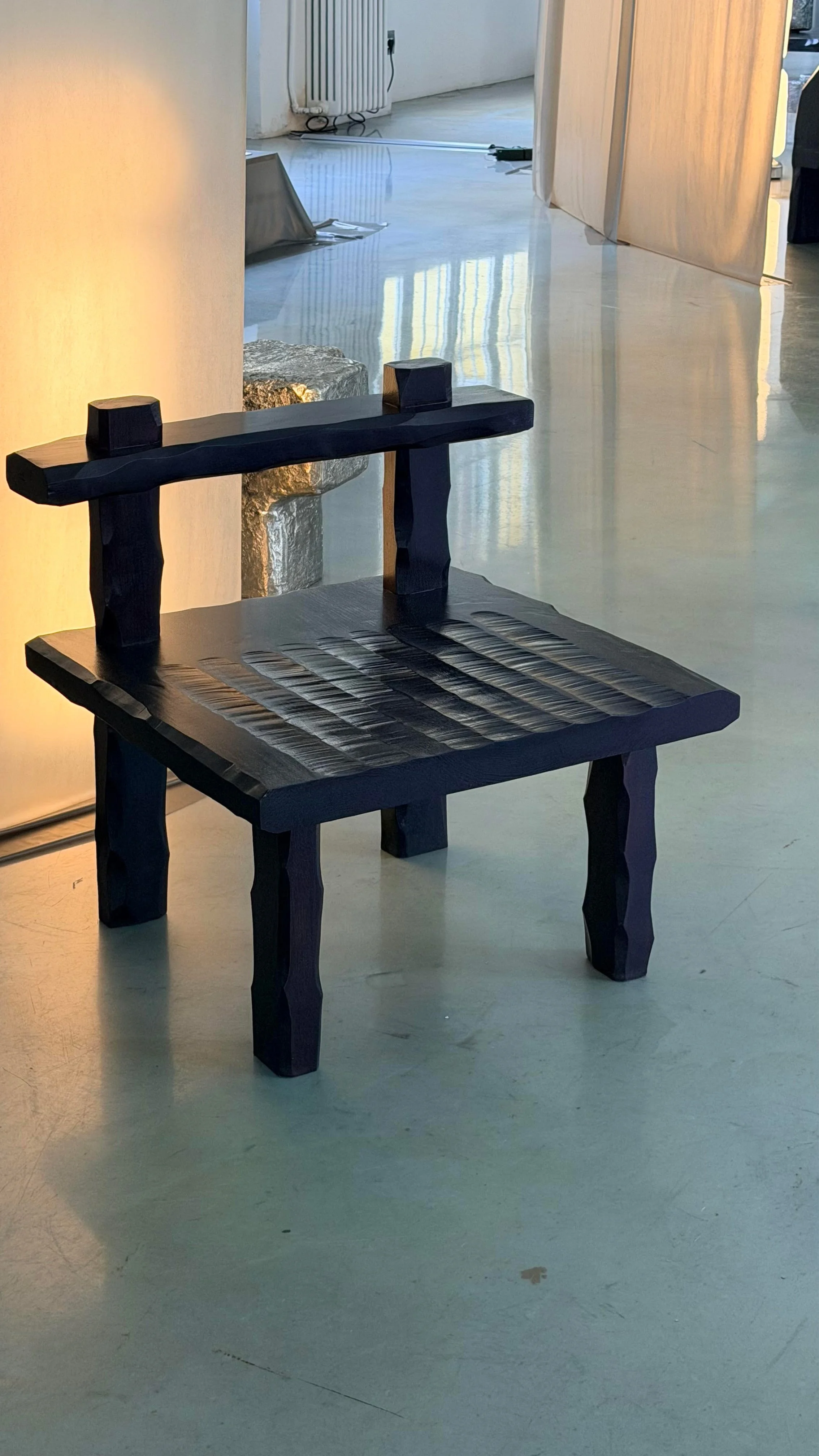
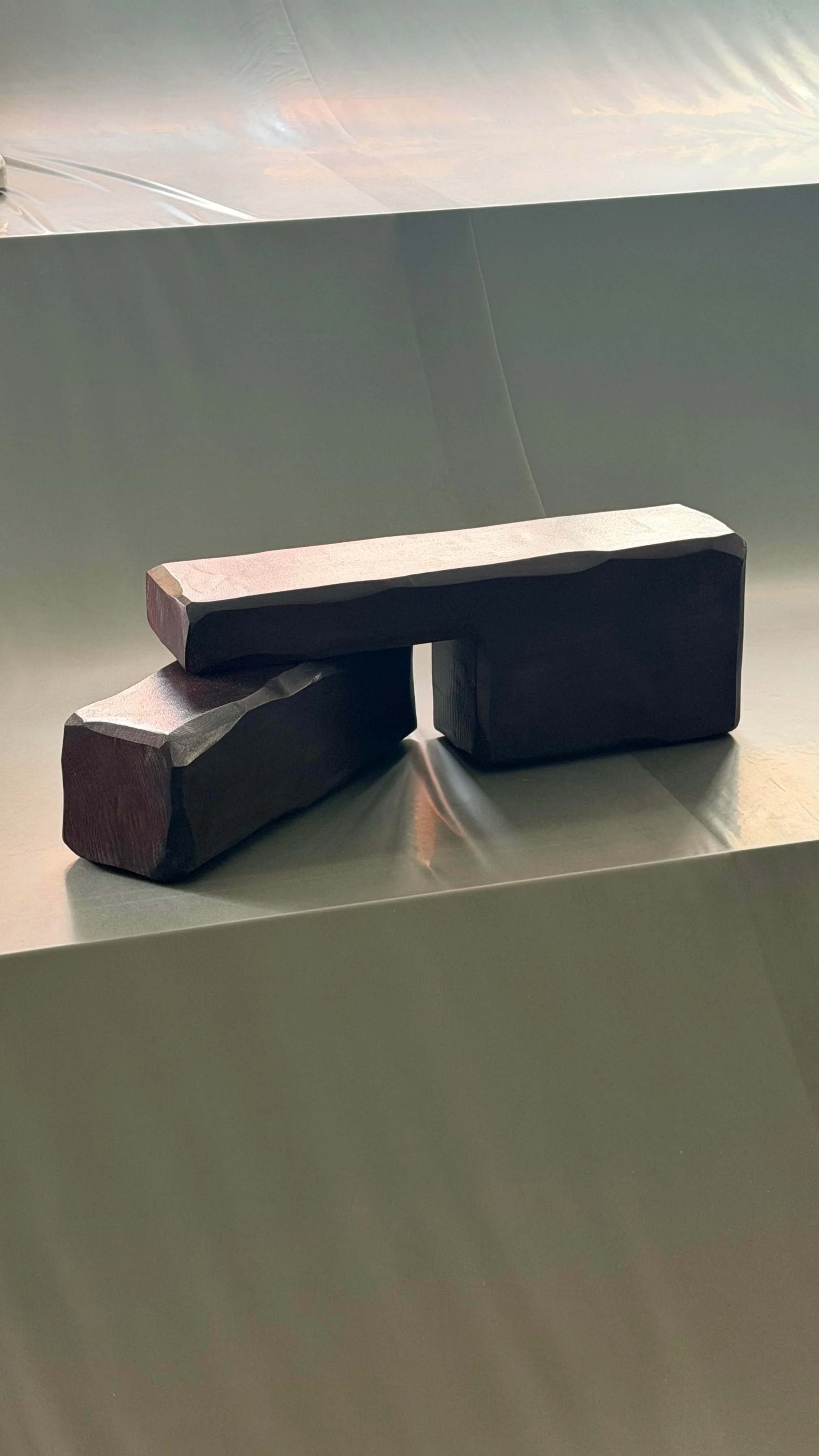
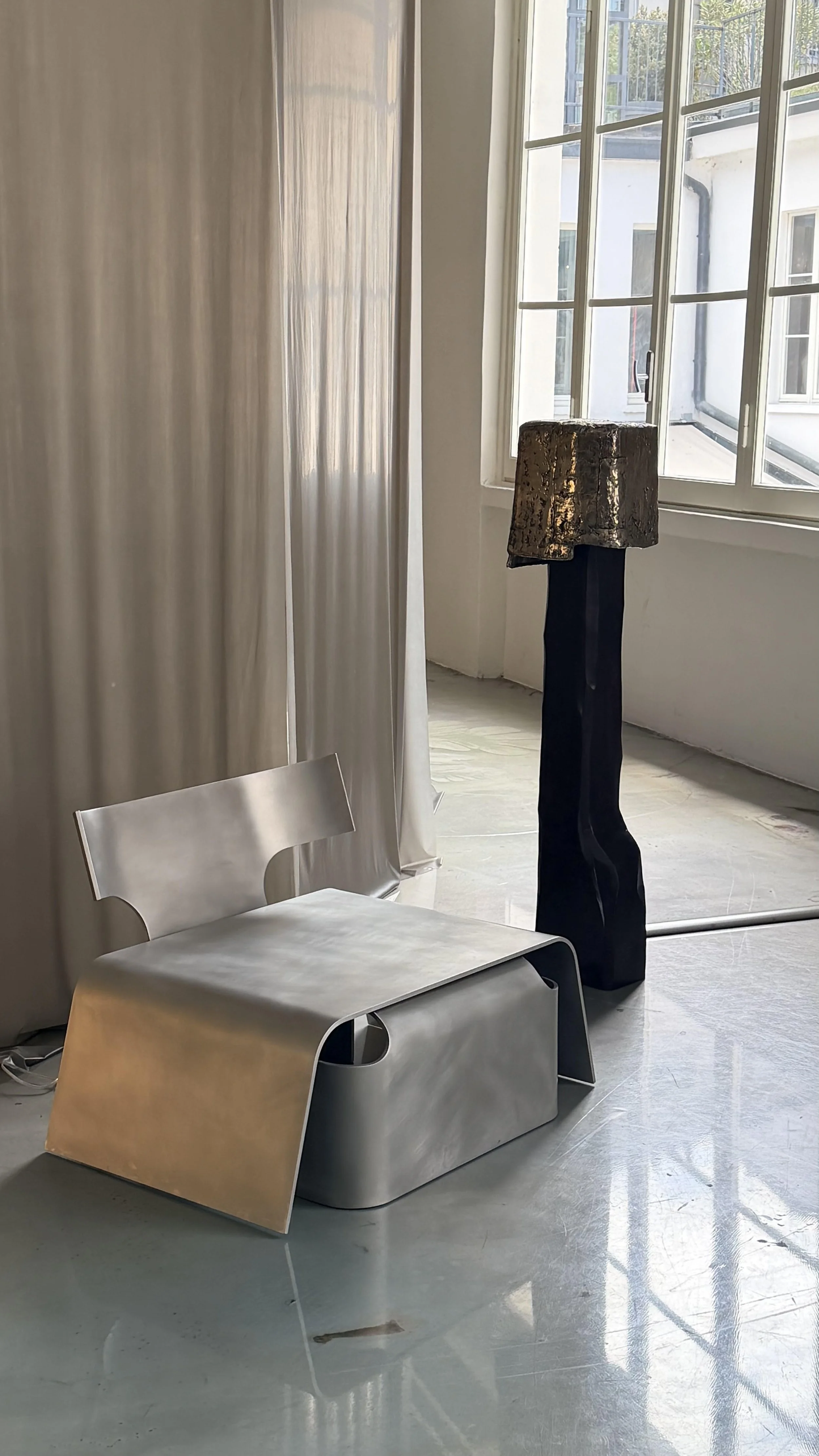
The show brought together a large body of work across a surprising range of materials: blown glass lamps, folded aluminium and leather sofas, timber carved chairs, cast metal tables. On paper, it could have felt disparate. In person, it was remarkably cohesive. Each piece seemed to test how one sculptural language might move through different materials while still retaining the same voice, the same hand, the same force of authorship.
What resonated was not refinement in the conventional sense. It was almost the opposite. The work had a primitive quality: forms crudely sculpted, stacked, folded, carved, or seemingly found rather than fully conceived. There was a looseness to it, but not a lack of control. A playfulness, but not frivolity.
The works felt exploratory without becoming scattered. Across glass, metal, timber and leather, Tangelder’s hand remained unmistakable.
That is difficult to achieve. Many bodies of work are cohesive because they repeat themselves. Others are exploratory because they abandon consistency. Here, the cohesion came from something deeper than style. It came from an attitude toward material and making. The pieces seemed to ask what each material could do, how it could hold weight, resist polish, carry gesture, accept imperfection and still become useful.
There was a physicality to the work that felt particularly compelling. The gesture of a chisel, hammer or hand was not refined away. It remained present in the object, not as decoration, but as evidence. The works felt made, and in that making they retained a kind of force. They did not ask to be admired from a distance. They had the quality of things ready to be touched, moved around, lived with and knocked about.
This is where the show began to connect with our own architectural thinking.
At Davidov, we often return to questions of mass, material presence and the comfort that can come from weight. In architecture, mass is not simply heaviness. It can be protective. Grounding. Reassuring. A thick wall, a deep reveal, a solid hearth, a carved threshold or a robust piece of joinery can all create a sense of permanence that is felt before it is understood.
The same can be true of furniture and objects. A chair, bench or stool with mass offers comfort before anyone sits down. It looks capable. It looks durable. It does not appear precious or anxious. It has the visual confidence of something that can absorb use, weather, marks and time. It is ready for life because it does not pretend to be untouched by it.
That quality was central to Tangelder’s work. Many pieces had a kind of hardy, knockabout character, as though they had already lived somewhere before arriving in Milan. They seemed to carry an unknown history of their own. This gave the work an emotional charge beyond its material experiment. The objects did not feel new in the polished, showroom sense. They felt newly encountered, which is different.
This distinction matters. So much contemporary design is preoccupied with novelty, with producing the appearance of the new. But the objects that endure often feel as though they belong to a longer continuum. They may be freshly made, but they seem to have some relationship to older instincts: stacking, carving, sheltering, balancing, holding. They remind us that making begins with force, touch and material resistance.
There was a thread of this throughout Milan this year, at least in the work I found myself drawn to. Designers drilling into mass, texture, primitivism and the sculptural object. Work that resisted polish. Work that felt closer to excavation than styling. Work that suggested the future of design may not be found in ever thinner, smoother or more frictionless things, but in objects with gravity, character and memory.
Perhaps this is also why Tangelder’s show felt architectural. Not because it resembled buildings, but because it shared architecture’s deeper concerns: weight, proportion, tactility, permanence, atmosphere and use. The pieces occupied the space with a quiet force. They had edges, shadows, density and presence. They understood that form is not only visual. It is bodily.
In our own work, we are interested in this same territory: architecture that is refined, but not fragile; composed, but not sterile; materially rich, but not ornamental for its own sake. We are drawn to spaces and objects that can carry life without being diminished by it. The best architecture is not precious. It accepts use. It deepens with occupation. It gathers marks, rituals and memory.
Tangelder’s Fluid Re-Collection felt important because it gave this thinking an object-scale intensity. It showed how a consistent language can remain open, how material experimentation can still feel grounded, and how primitive form can carry both playfulness and seriousness at once.
Amid the abundance of Milan Design Week, it was not the loudest work that stayed with me. It was work with mass, touch and an unmistakable hand. Work that felt both ancient and newly made. Work that seemed already alive with an unknown history of its own.
Related reading: Travel as Architectural Education

I was recently interviewed by Elana Castle for an article in The Age about travel, design inspiration and the ways our experience of place shapes how we think about home. It was a conversation that stayed with me, because travel has long been central to how I understand architecture, first as a student and now through practice.

Travel as Architectural Education
I was recently interviewed by Elana Castle for an article in The Age about travel, design inspiration and the ways our experience of place shapes how we think about home. It was a conversation that stayed with me, because travel has long been central to how I understand architecture, first as a student and now through practice.
As I said in the piece, travel served as a series of pilgrimages for me as an architecture student, and it remains a deeply informative pursuit. What I have come to value most is not travel as escape, nor even as inspiration in a superficial sense, but as a form of education. It teaches you to see architecture properly, not as an image, but as something embodied. Something inhabited, touched and remembered through light, weather, sound and time.
This feels increasingly important in a culture where architecture is so often reduced to imagery. Buildings are flattened into photographs and judged by immediacy. What gets lost are the qualities that make architecture meaningful: the weight of a wall, the way a threshold compresses or releases, the dimness of a corridor before it opens into light. These are not things that can be understood from a screen. They have to be encountered.
Travel does not educate by offering a catalogue of forms to borrow from, but by refining judgment. It sharpens your understanding of atmosphere, proportion, sequence and material presence. It makes you more attentive to what endures and less interested in novelty for its own sake.
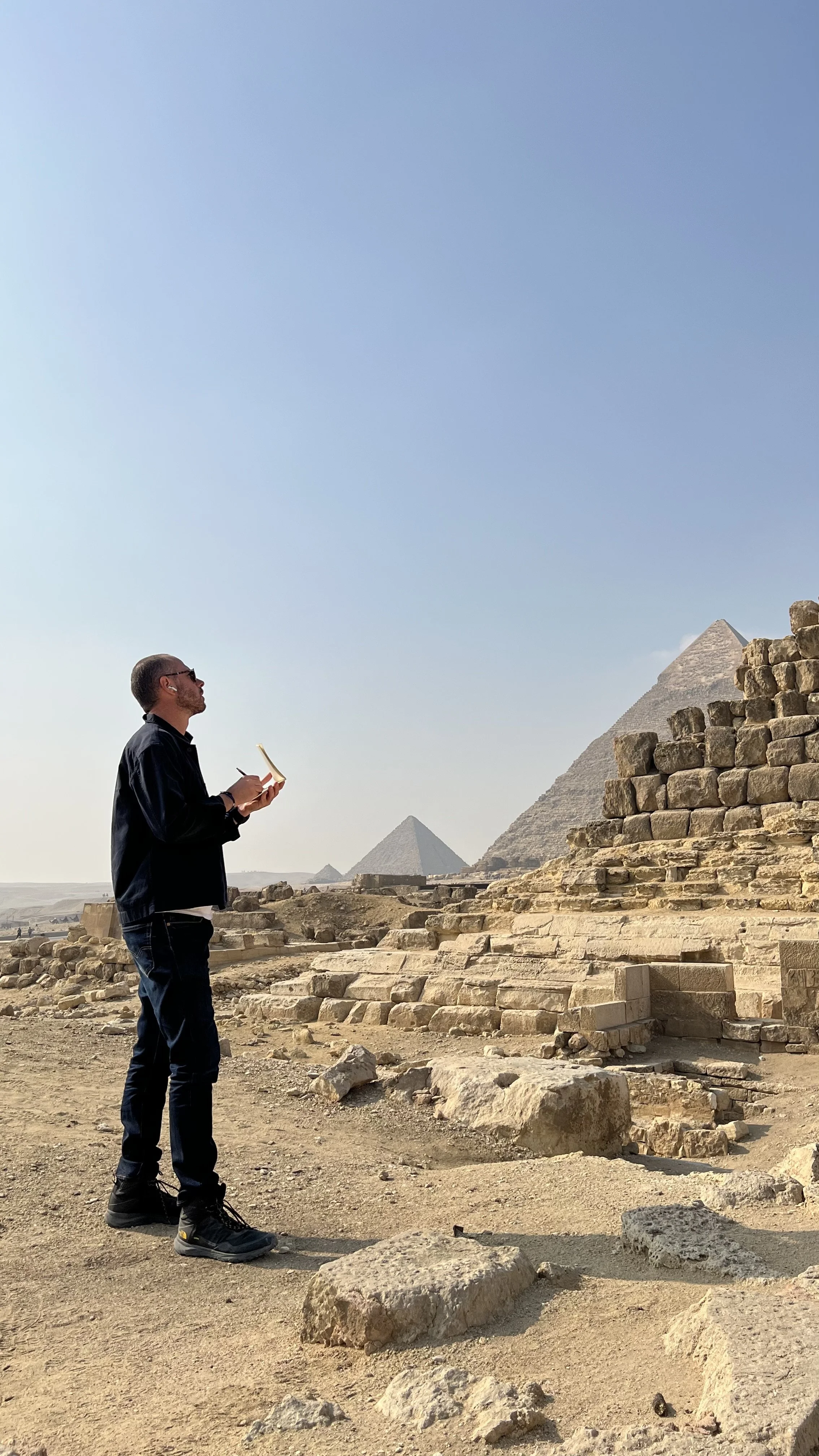
Much of what has stayed with me has come not from monuments alone, but from vernacular architecture, ruins and places shaped slowly over time. Travelling through Morocco, Israel, Egypt, Peru and Italy, I found myself drawn to buildings where material honesty and endurance were inseparable from beauty. Those experiences reinforced the idea that architecture is most convincing when it feels necessary, grounded and able to age with dignity.
Travel also teaches you how architecture is revealed. The most memorable spaces are often those that unfold with restraint. A narrow entry, a bend in a path, a darkened threshold, a courtyard that appears gradually. These moments stay with you because they involve the body as much as the eye. They remind you that architecture is a sequence before it is an object.

That lesson has remained central to my own work. In the article, I spoke about examining Tadao Ando’s work in Japan, particularly on Naoshima, and how instructive it has been to study the way he controls the experience of entering a space. Doorways, in particular, have become emblematic of how I think about design. They are never simply a point of access, but the beginning of atmosphere and orientation.
When considered carefully, a doorway can compress, conceal, frame, delay or release. It prepares the body for what comes next and heightens awareness of shadow, sound, texture and temperature. In that sense, it contains many of the questions travel teaches us to ask of architecture more broadly.
This is where travel becomes more than reference gathering. The more seriously one travels, the less inclined one is to copy. What it offers instead is a more disciplined eye. It reveals the difference between effect and atmosphere, between abundance and potency. Often it is the sparing use of material that gives it weight. A single stone wall, a dark timber opening, a carefully lit passage can carry more presence than a room full of gestures.
For this reason, travel continues to shape how I think about materials in practice. Most materials are more powerful when used with restraint. They are allowed to weather, to gather shadow and to reveal texture slowly. The buildings that endure are rarely those that announce themselves most loudly, but those whose materials have been chosen with conviction and allowed to age into themselves.
Perhaps that is the deeper lesson travel offers architecture: not style, but perspective. It reminds us that the best buildings are not composed only for the moment of completion. They are made to be lived with, approached repeatedly and understood more fully over time.
To travel well is to become more attentive to that kind of architecture. It is to learn not only by looking, but by moving through buildings and carrying them with you afterward. For an architect, that is a form of education that never really ends.
Related reading: Before you renovate, visit these destinations for the best in design inspiration - Elana Castle, The Age
The best renovations do not begin with a new look. They begin with listening and observing.

Letting the House Speak
The best renovations do not begin with a new look. They begin with listening and observing.
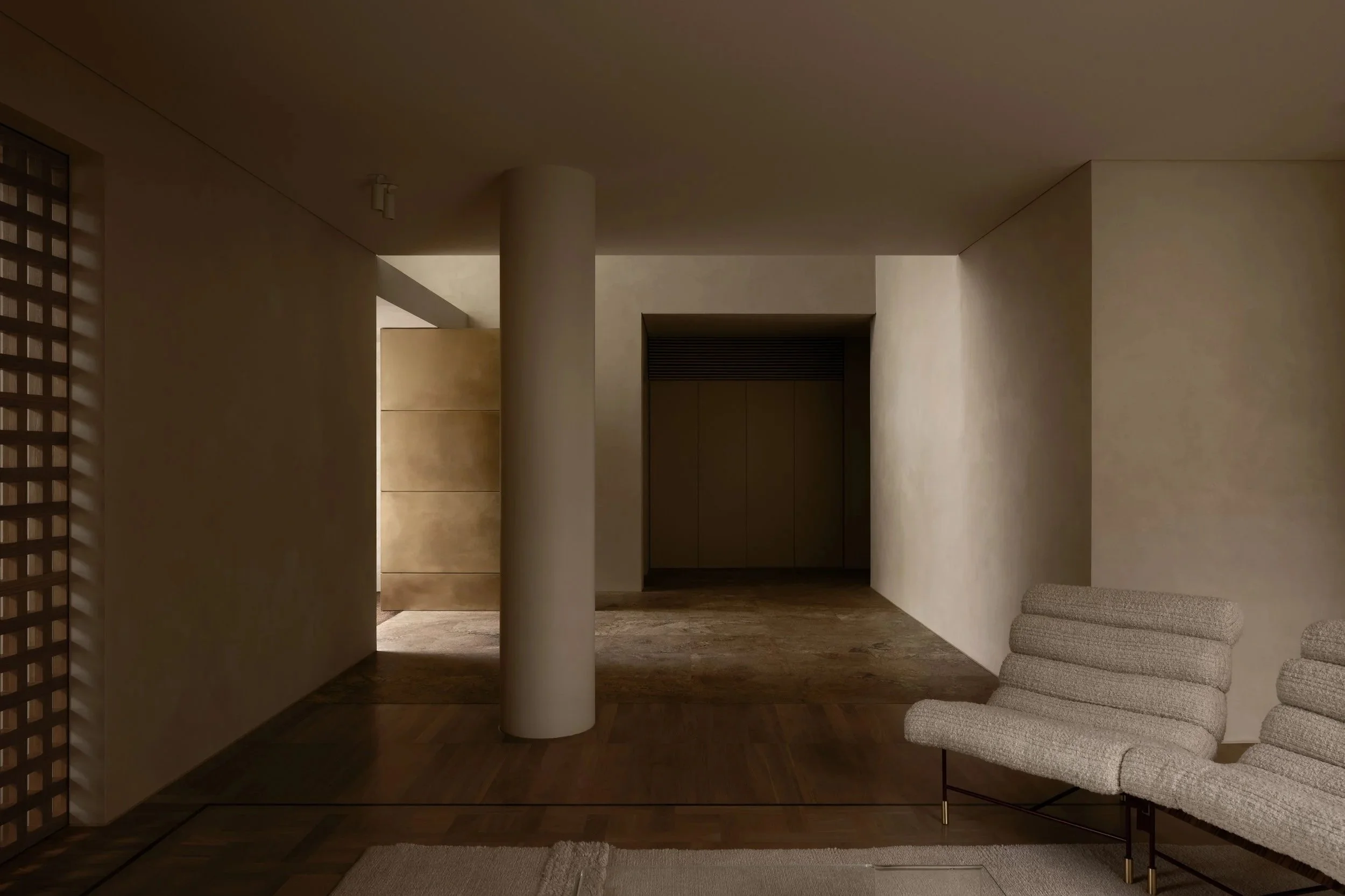
A house that has stood for decades already contains something of itself - a presence, a mood, a particular relationship to light, garden, street and sequence. Even where it is awkward, altered or unresolved, there is often still an underlying dignity to it. Age gives a house certain advantages. It may sit within an established garden. Its proportions may feel settled. Its walls, openings and setbacks may belong naturally to the street in a way that is difficult to recreate. Even buildings that are not conventionally beautiful can possess a kind of charm simply because they have endured.
Inside, that character is often carried through in quieter ways. Smaller openings, thicker walls, skirtings, cornices, ornament, compressed rooms or more formal thresholds can create an experience very different from contemporary space. This does not mean everything should be preserved untouched. Nor does it mean every original detail is inherently good. But it does suggest that renovation should begin with respect for what is already there, rather than with the urge to overwrite it.
Often, the first task is not addition but clarification.
Some houses remain close to their original condition. Others have been altered repeatedly, with each renovation leaving behind a different layer of compromise. In those cases, the work is often as much about undoing as it is about making.
Confused planning, cosmetic upgrades and heavy-handed extensions can leave a house feeling fragmented, no longer fully itself, but not convincingly transformed either. Before any architectural language is imposed, there is a need to find order again.
That process is partly practical. It may mean opening up where needed, closing down where appropriate, or rethinking how the plan supports daily life. It may mean improving utility, restoring clarity to circulation, or finding a more coherent relationship between old rooms and new uses. But it is also more intuitive than that. It involves allowing the house to reveal what matters.
In that sense, a good renovation is not an act of invention so much as an act of recognition.
This is why restraint matters. Not as an aesthetic posture, but as a way of working with sincerity. When an architect approaches an existing house too forcefully, the result can feel insincere - either overly eager to mimic the past, or too determined to dominate it. Both tend to diminish the building. In period homes, this can show up through questionable upgrades: ornamental additions that were never there, inappropriate roof tiles, overly worked surfaces, or new materials that call too much attention to themselves. Elsewhere, it appears in extensions so assertive that they overwhelm the original building and leave its retention feeling almost incidental.
A more considered approach asks for a deliberate conversation between old and new.
That conversation will be different every time. Houses vary enormously in age, character and condition, and there is no single formula for what should remain or how the new should appear. For us, the most useful position is to be as open-minded and as gentle as possible. To keep what can genuinely be retained. To restore where that is appropriate. To let the original building remain legible. When the architect’s ego is set aside and the house is properly respected, the result is usually more convincing. It is more sincere, often more distinctive, and very often more economical as well.
What the new work should add is not a replacement identity, but the spaces and qualities the house is missing. Often that means better connection to outdoor space, more light, improved storage, clearer planning, or a stronger relationship between formal and informal areas of life. Sometimes the intervention is substantial. At other times it is more like a refurbishment, focused on finishes, services, lighting, kitchens, bathrooms and the quiet upgrading of how the house performs. The scale changes, but the principle does not. The aim is to make the house more complete without making it less itself.
This is where renovation can achieve something that a new build often cannot. It can retain warmth, individuality and patina while also accommodating contemporary life with greater ease.
The final result may be more subtle than a new house, but it is often richer for exactly that reason. It carries memory. It accepts irregularity. It allows character to survive alongside change.
When a renovation is successful, that success is usually obvious. The original feels not only retained, but understood. The new work flows from it naturally. It responds to the existing scale, materiality and detail without imitating them too literally. It introduces spaces, outlooks and forms of amenity that the house could not previously offer, but does so without strain. Old and new sit together with a kind of ease. Neither tries to cancel the other out.
That, ultimately, is what people should look for when choosing an architect for this kind of work. Not simply a style they admire, though that matters. More importantly, they should look for someone who is genuinely interested in engaging with the house. Someone willing to work with what is there rather than against it. Someone who understands that the best outcome rarely comes from imposing a ready-made answer, but from paying attention long enough for the right response to emerge.
Related projects: Prahran Residence, LDS Residence II, GG Residence, RSB Residence.
Photography by Timothy Kaye.
A guide for clients building or renovating in Melbourne and Victoria.

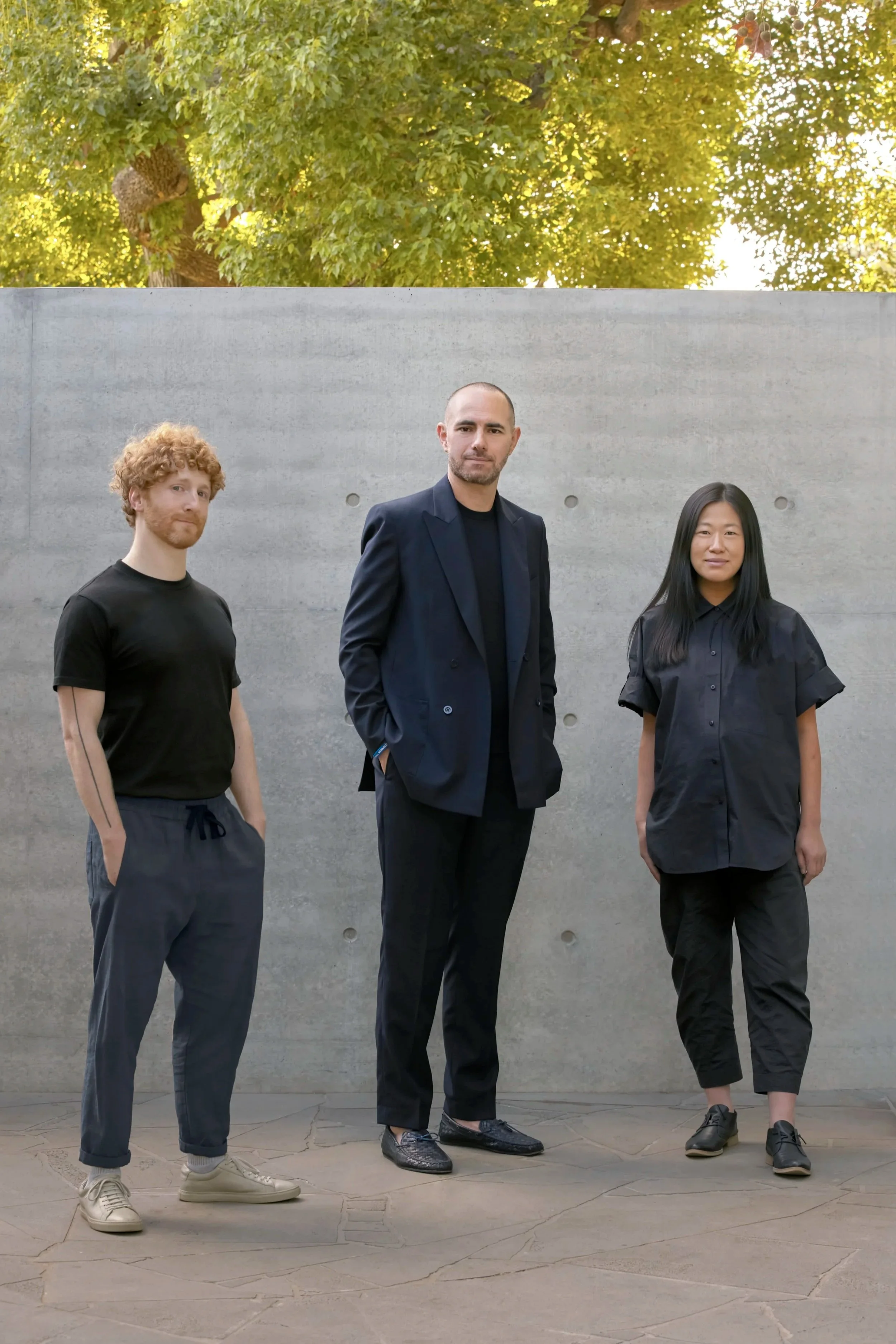
How to Choose the Right Architect
A guide for clients building or renovating in Melbourne and Victoria.
Choosing an architect is rarely about finding the “best” practice. It is about finding the right fit. Most people only build once. The process can be exciting, but it can also carry uncertainty. The architect you choose should bring judgement and steadiness, and make decisions clearer rather than louder.
A home is not a single view. It is experienced in sequence. Arrival, threshold, movement, pause. Light shifts across the day and across seasons. Privacy and outlook are negotiated room by room.
There are simple questions that reveal a great deal. Does the plan feel calm and legible. Do the spaces support both quiet and activity. Does the home feel composed rather than busy. When restraint is done well it does not feel empty. It feels deliberate. It frames life with clarity and leaves room for presence.
Most projects become difficult through decision fatigue, not through lack of taste. The difference between a calm project and a stressful one is often the method of decision-making. A strong practice has a clear way of testing options, resolving a direction, and protecting the integrity of the design as constraints tighten. Refinement is not indulgence. It is the work.
Style labels are often the first language people reach for. Modern, minimal, contemporary. Sometimes they are useful as shorthand, but they rarely describe what makes a home live well.
Underneath the label there is a deeper discipline: proportion, light, material honesty, and how the building will weather and settle over time. A restrained home can be warm and deeply personal. It can also be demanding. The strongest outcomes tend to come when client and architect share a temperament, patient, thoughtful, willing to arrive at fewer decisions, better made.
Many clients speak with several established residential studios before choosing the right fit. The difference is rarely quality. It is how you want the process to feel, how decisions are guided, and what you want the home to become over decades.
At Davidov Architects, we design architecture where atmosphere is the primary outcome. We work best with clients who value a guided process, material integrity, and homes that become more convincing with time.
A first conversation should be calm and useful. It should clarify scope, planning realities, constraints, and likely next steps. A helpful way to begin is to share your site, your approximate timeframe, and two or three reference projects that resonate. From there, it should be possible to tell quickly whether the fit is right.
Related pages: Residential Architects Melbourne, Our Process, Contact.
Related reading: Who We Are For, Our Process, Client Considerations, Atmosphere as the Vessel for Life.

The word “brutalism” carries baggage. People picture coldness, severity, or a concrete box with little care for life inside. That is not what we mean when we use the word, and it is not what we pursue.
Brutalism as Shelter
The word “brutalism” carries baggage. People picture coldness, severity, or a concrete box with little care for life inside. That is not what we mean when we use the word, and it is not what we pursue.
For us, it is a question of shelter. It is mass, shadow, few materials, and depth. It is architecture that carries weight without being heavy-handed.
The misunderstanding is that this is plainness. In fact, the best work in this territory is sculptural. It is subtle. It is about the play of light across a surface, the suspension of mass, the reveal, the tension between protection and openness. It is not a blank box. It is sculpture over plainness.
Shadow is relief
Shadow is not a negative. Shadow is relief. It slows the eye. It underlines proportion. It renders bright moments more vividly because they arrive by contrast.
When we design with mass, we are not designing for intimidation. We are designing for protection and calm. A thickened threshold can make arrival feel like a transition rather than a collision. A deep reveal can temper light and create refuge. A courtyard wall can hold privacy while still allowing air and sky to be felt.
Fewer materials, more meaning
A restricted palette is not an aesthetic limitation. It is a way of concentrating attention. When there are fewer materials, junctions matter. Scale matters. Light matters. The building has a better chance of ageing well, because it is not dependent on surface novelty.
Weight does not need to feel cold. It can be deeply inhabitable when it is paired with warmth of light, considered proportion, and spaces that receive the body properly.
Lineage, lightly
People sometimes arrive with references like David Chipperfield. We understand why. What we respect from that lineage is the quiet authority of massing, the clarity of considered simplicity, and the confidence of restraint. But the goal is never to imitate. The goal is to apply the same rigour in service of domestic life, shelter, and atmosphere.
Proof in our work
VJP and AJL carry the qualities people often associate with this territory, without the harshness. They hold mass and shadow. They limit materials. They use depth, reveal, and sequence to shape calm. They show that weight can be composed, and that restraint can still be generous.
If we had to summarise our position simply, it would be this: weight and restraint can produce architecture that is calm, protective, and deeply inhabitable.
Related projects: Sorrento Bathhouse, EPSC Residence, VJP Residence.
Related pages:Mornington Peninsula Architects, Longevity and Performance.
Related reading: On Openings, The Entry, Atmosphere as the Vessel for Life.

We sometimes think of a room, or even a house, as something carved from a wall. The wall can be the whole from which space is extracted, or it can be the threshold that divides two worlds.

The Thick Wall
We sometimes think of a room, or even a house, as something carved from a wall. The wall can be the whole from which space is extracted, or it can be the threshold that divides two worlds.
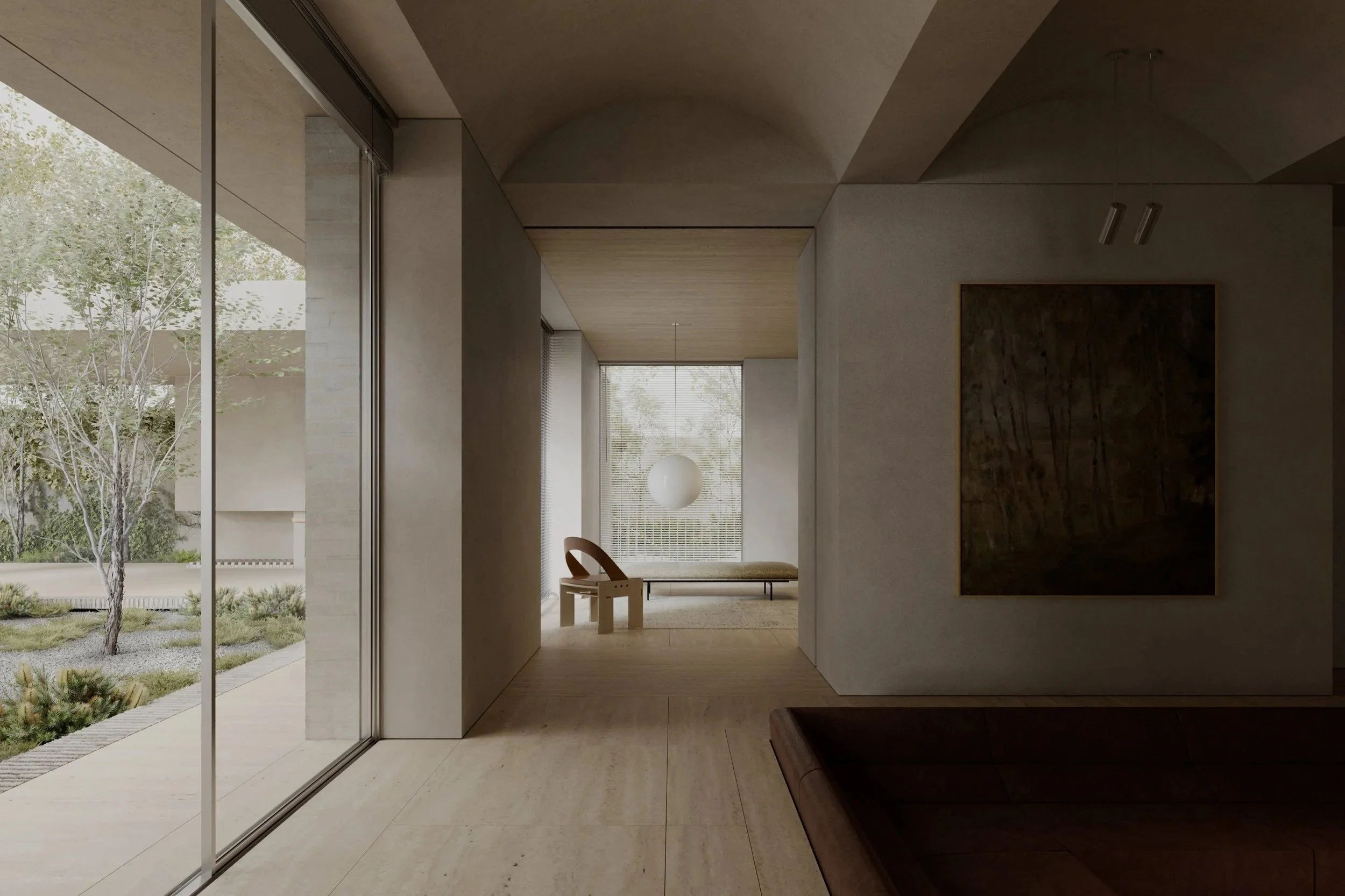
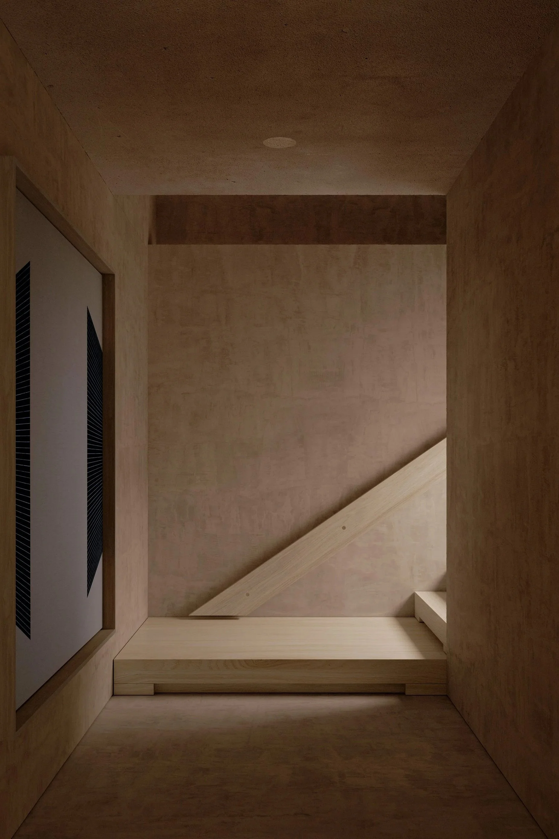
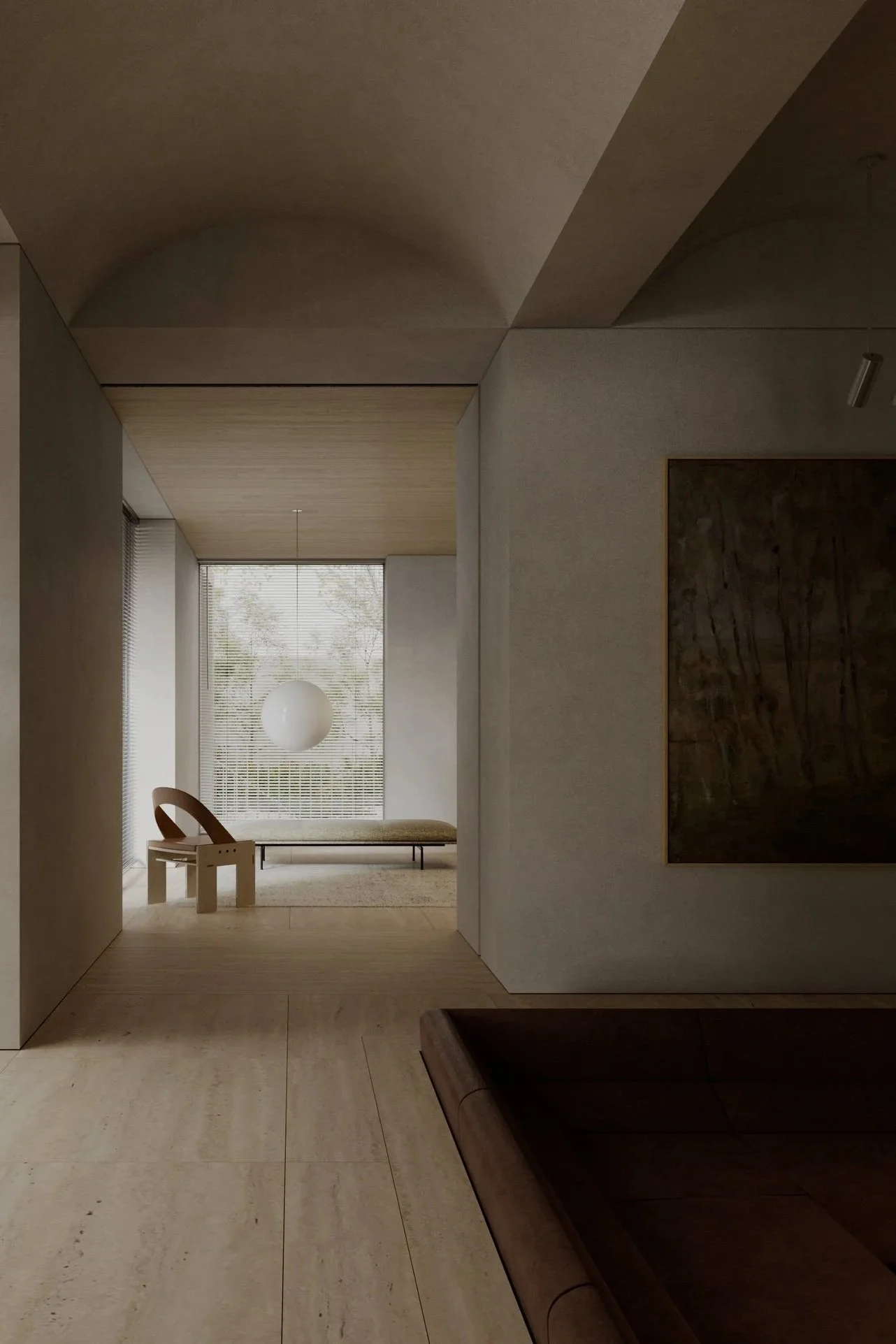
This is not a literal idea only. It is an architectural one. Thickness is depth. It is clarity. It is protection. It is security. It carries tradition. Thickness suggests quality and integrity, not because it is heavy, but because it takes responsibility for shelter.
In many contemporary homes, walls become thin lines. Openings become holes. The transition between inside and outside becomes abrupt. The result can feel exposed, flat, and visually noisy.
A thick wall is a different proposition. It slows the home down. It allows arrival to be composed. It gives a window depth and meaning. It turns light into something you move through, not just something you receive.
Entry threshold
We care about the entry because it sets the emotional register of the home. A thickened entry is not simply a door. It is a moment of compression before release. It is a place where shadow prepares the eye for light, and where the street falls away.
This is where calm begins. Not in a stylistic flourish, but in a deliberate transition.
Courtyard edge
Courtyards are often understood as open space. We think of them as architectural, 'outdoor rooms'. The perimeter of these rooms, the courtyard wall, can hold privacy while allowing the sky to be present. It can receive light, slow it, bounce it, soften it. It can make outside feel close without being exposed.
A courtyard is not a mere amenity. It is an engine of atmosphere.
Window reveal
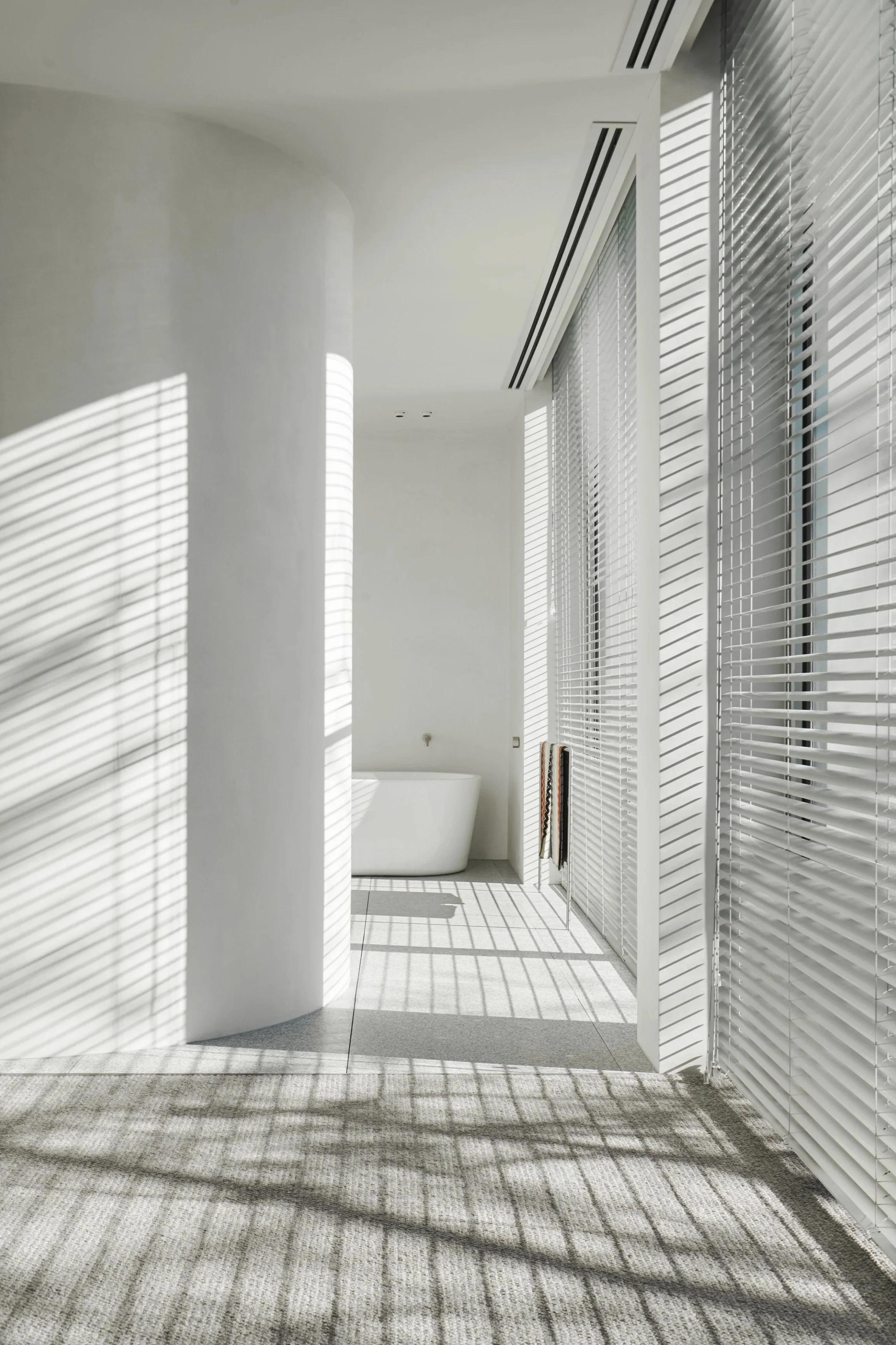
A window is never neutral. A deep reveal changes everything. It frames viewlines. It holds shadow. It protects from glare. It makes the outside legible as a composed scene rather than a raw panorama. It gives the wall substance, so the building feels carved rather than assembled.
In our work, openings are rarely treated as simple voids. They are thickened, calibrated, and often aligned with movement so that the home becomes cinegraphic. You do not see everything at once. You move, you pause, you discover. Light arrives where it is needed, not where it is easiest.
Lineage, lightly
If someone thinks of John Pawson when they think of thickness, it is often because of his attitude towards proportion and discipline of reduction. We share respect for those fundamentals, but we apply them to domestic life in Melbourne and Victoria, with its shifting light and its need for both openness and shelter.
Proof in our work
NPW, HMM, and LDS Residence I show what thickness can do. Courtyards, layered apertures, and careful reveals allow privacy and outlook to coexist. The home feels composed rather than exposed, protective without becoming closed.
The thick wall is not nostalgia. It is a tool for making atmosphere. It holds shadow, frames light, and gives domestic life a sense of refuge.
Related projects: RZTK Residence, LDS I Residence, Sorrento Bathhouse.
Related pages:Toorak Architects, Caulfield North Architects.
Related reading: On Openings, Courtyards, The Entry.

People often use “warm minimalism” when they are caught between two instincts. They want clarity, calm, and a contemporary home that feels resolved. At the same time, they fear something sterile, machine-like, or emotionally distant.

Warm Minimalism is not Absence
People often use “warm minimalism” when they are caught between two instincts. They want clarity, calm, and a contemporary home that feels resolved. At the same time, they fear something sterile, machine-like, or emotionally distant.
The misunderstanding is that restrained homes are defined by what is missing. In reality, the strongest homes in this territory are defined by what is present, and what has been chosen deliberately. Restraint is not a style of removal. It is a way of living with intention.
A restrained home can be deeply personal. It can be more engaging, not less, because every element is asked to carry weight. Light has a job to do. A threshold has a job to do. The palette must earn its place. When there are fewer moves, each move matters more.
Warmth is not decoration
Warmth in architecture does not come from adding objects. It comes from how a space receives you. It comes from proportion and sequence, from softness and shadow, from the way surfaces carry light.
In our work, warmth is often held in a small number of materials that age well over time. Hard plaster, for its sheen and fine irregularity, is never flat. It changes across the day. It gives light something to catch. Terracotta carries character and variation and a certain casualness. It refuses to be sterile. Limestone has resilience and an understated luxury. It feels composed without needing to shout.
A restrained home is not impersonal. It is more deliberate, more profound, and in its own way, more pure. It frames daily life rather than competing with it. It does not ask to be noticed, yet it rewards attention. This way of living is not for everyone. But for those drawn to it, it brings clarity, order, and a quieter kind of richness.
The home as a vessel
We think of a home as a vessel for life. The role of architecture is not to dominate, but to support and heighten experience.
When a home is calm, you become more present. When the plan is coherent, you move through it without friction. When the palette is restrained, small changes become meaningful: morning light across plaster, the temperature of stone at dusk, the shadow of a reveal deepening as the day slows.
This is where restraint becomes more than a look. It becomes a discipline. It asks for editing. It asks for patience. It asks for fewer decisions done better.
It is easy to make something sparse. It is much harder to make something spare and generous at the same time.
Lineage, lightly
We understand that cultural shorthand for this approach sometimes leads people to designers and architects like Vincent Van Duysen or John Pawson. What we take from that lineage is not a style, but a sensibility - a focus on proportion and restraint, and a regard for light as a material in its own right. The aim is always to make spaces that feel inevitable, not composed.
Proof in our work
LPS Residence and HMM Residence show that restraint does not mean emptiness. They show how clarity can still be sensuous, how a small palette can still hold variation, and how atmosphere can be built from light, depth, and material honesty rather than ornament.
If we had to summarise our position simply, it would be this: warmth comes from intention. From what is chosen and protected, not from what is added.
Related projects: LPS Residence, HMM Residence, LDS II Residence.
Related pages:Residential Architects Melbourne, Architecture as Interiors.
Related reading: Atmosphere as the Vessel for Life, On the Gesamtkunstwerk, Time as a Material.

Architecture is often discussed in terms of image, but lived experience is shaped by quieter qualities. Space, sequence, light, proportion, and atmosphere determine whether a home feels calm, generous, and supportive of daily life.

Atmosphere as the Vessel for Life
Architecture is often discussed in terms of image, but lived experience is shaped by quieter qualities. Space, sequence, light, proportion, and atmosphere determine whether a home feels calm, generous, and supportive of daily life.
At Davidov Architects, we design architecture where atmosphere is the primary outcome.
Atmosphere is not decoration. It is the lived quality of a place. It is how a home centres you, shelters you, and allows life to unfold without distraction. Atmosphere is also the emotional register of a home, shaped through light, proportion, and sequence.
In Victoria, atmosphere matters. Light shifts across seasons. Shadows lengthen, soften, and retreat. Coastal glare, winter low sun, and the long tones of afternoon light each ask something different of a building. A home becomes meaningful when it is designed to receive these changes, not resist them.
A facade is a single moment. Living is a sequence. A home is experienced through arrival, threshold, movement, and pause. It is defined by how spaces open and contract, how views are framed, and how light enters and recedes over the course of a day. These qualities determine whether architecture feels calm or exhausting to inhabit.
Brutalism, at its best, is not aggression. It is material honesty, thickness, shadow, and permanence, architecture that shelters first and becomes more convincing over time.
For this reason, we are cautious of architecture that relies on image alone, or complexity for its own sake. Visual impact may be immediate, but it does not automatically translate into an enduring lived experience.
We approach the home as a series of composed views and lived scenes. Openings are deliberate. Light is borrowed. Courtyards, walls, and voids create depth, privacy, and atmosphere. An opening is never neutral. It shapes how the outside world is perceived and how the interior feels.
Longevity does not happen by accident. It is a design decision, protected across hundreds of choices. We ask practical and experiential questions throughout the process. How will this be built. How will this detail age. How will the space feel in morning and afternoon. Where will the hand touch, and what will it learn over time.
Time is a material. Patina is not failure. Architecture that ages with dignity becomes more familiar, more grounded, and more humane.
Building can be stressful, not because clients lack judgement, but because decisions carry weight. Our role is to steady the process. We explain design rationale, provide clear options, and use visual tools to make space and atmosphere legible. Some clients want close involvement. Others prefer trust and clarity. Both are valid.
What matters is that the finished home feels inevitable. Familiar in the deepest sense. A vessel for life that supports living over decades.
Related projects:EPSC Residence, LPS Residence, Sorrento Bathhouse.
Related pages: Residential Architects Melbourne, Our Process.
Related reading: Our Process and the Editorial archive.
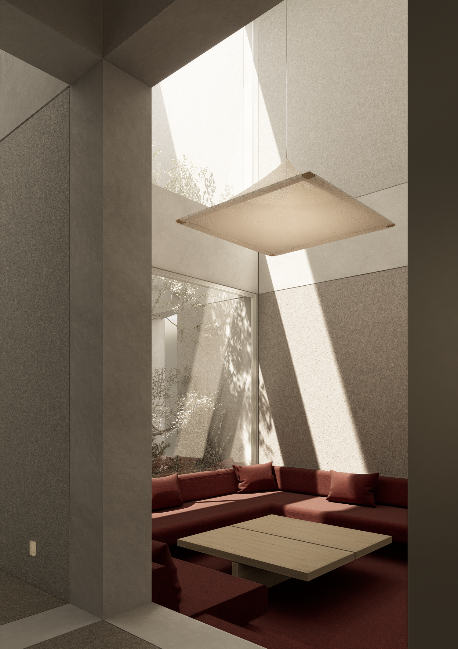
Architecture reveals itself most clearly at the moment it allows something to pass through it. Light, air, view, a body, time.

On Openings
Architecture reveals itself most clearly at the moment it allows something to pass through it. Light, air, view, a body, time.
An opening is never neutral. It is not simply the absence of wall, or floor or roof. It is an act, a decision, a position taken on how a building relates to the world beyond it - how you will relate and interact and how the outside will interact with you.
In much contemporary work, openings are the result of division. Walls are split apart, pulled back, erased in service of plan, program, or transparency.
There is another way of thinking about openings. One that begins with the assumption that the wall matters.
To pierce a wall rather than divide it is to first acknowledge its mass, its weight, its continuity - its integrity. The opening is not made by separating, but by carefully cutting into something whole - something valuable. It is less violent, more deliberate, and often quieter. The wall remains present, and the opening gains meaning because of it.
This distinction, subtle as it may appear, produces very different atmospheres.
Louis Kahn was the master of the opening. In his Bangladesh parliament in Dhaka, openings are simultaneously sculptural and graphic. The walls remain heavy, almost immovable, and yet they are alive with openings that feel inevitable and expressive. At the Indian Institute of Management in Ahmedabad, apertures are treated as moments of passage and compression. The thickness of the wall becomes a place in itself, a zone where inside and outside briefly coexist.
Elsewhere, Claudio Silvestrin’s Neuendorf House in Majorca operates with similar consideration. Its openings are celebrated and deliberate characters: sometimes they are measured incisions within continuous surfaces, other times they appear as slices cutting walls in two.
What these projects share is a respect for mass. A belief that architecture begins not with void, but with substance.
Within our own work, we have explored both approaches. We have split walls open to create generosity and connection. We have also pierced them, carefully, to test how little is required to admit light, view, or movement. Over time, the difference has become increasingly apparent, not just visually, but experientially.
As our work evolves, we are consciously moving away from buildings that read as extrusions of the floor plan. Plan remains essential, but it is no longer sufficient. We are more interested in architecture as a three-dimensional condition, where walls are volumes, not lines, and openings are shaped with intention.
An opening asks a question of a wall. How much can be removed without diminishing what remains? How deep must it be to feel generous rather than exposed? How can it admit the world without surrendering the room?
These are modest questions, but they carry weight. They affect how a space feels at different times of day. They shape how we move, where we pause, and how architecture reveals itself slowly, over time.
National Parliament of Bangladesh | Louis Kahn
Neuendorf House | Claudio Silvestrin
Related projects: EPSC Residence, Sorrento Bathhouse and RZTK Residence.
Related pages: Mornington Peninsula Architects, Architecture as Interiors.

I was listening to a podcast today. Not on architecture. I tend to avoid design content when I am trying to switch off because it leaves me more agitated than relaxed. But one word in this unrelated conversation caught me: temporariness.

The Architecture of Temporariness
I was listening to a podcast today. Not on architecture. I tend to avoid design content when I am trying to switch off because it leaves me more agitated than relaxed. But one word in this unrelated conversation caught me: temporariness. It stayed with me. The term is both fleeting and grounding, a reminder that the moment is always moving and yet still available to be noticed. Thinking in terms of temporariness lifts you out of distraction, then returns you to the present with greater clarity.
We move quickly. We rush from task to task, place to place, absorbed in our screens and the immediacy of what is required. It feels like presence, but it is not. We are attentive to the task rather than the atmosphere. The mind is full, but not mindful.
Temporariness reveals how the here and now is always shifting. Sometimes this is dramatic: a storm breaking open the sky, a burning sunset, a full moon rising. These moments grip us, then fade.
More often, temporariness is subtle. A cloud softening the light. A quiet shift in colour from morning to afternoon. The slow movement of leaves casting patterns across a room. These small changes are where most of life unfolds.
Architecture becomes meaningful when it is designed to receive these shifts. A walled courtyard that captures the movement of the weather and turns the sky into a kind of theatre. A large skylight that frames the heavens and makes passing clouds legible. A deep reveal that slows the transition from inside to out. These elements anchor us by giving form to what is otherwise easy to overlook.
To design with temporariness in mind is not to seek spectacle. It is to make the ordinary visible again. It restores the capacity to notice the world as it changes around us.
The temporary is always there. Architecture, at its best, helps us stay conscious of our place within it.
Related projects: Sorrento Bathhouse, RZTK Residence.

This piece began as a conversation.
Last month, Hannah Abbott from Otomys invited me to join a panel discussion with Helen Redmond as part of Still Point, the exhibition marking the gallery’s fifteenth anniversary.

Photographed by Bernie Wright
Still Point
This piece began as a conversation.
Last month, Hannah Abbott from Otomys invited me to join a panel discussion with Helen Redmond as part of Still Point, the exhibition marking the gallery’s fifteenth anniversary. Sitting beside Helen, surrounded by her paintings, I realised that the themes we spoke about that afternoon reached far beyond the event. They touched on the foundations of my architectural education, the buildings that shaped me, and the way I think about light, order and restraint.
My connection to Helen’s work is longstanding. I have admired her paintings for many years and am fortunate to live with one. It hangs in our meeting room, directly behind me when we present projects. Her work feels familiar not because it depicts recognisable spaces, but because it captures something essential about how space behaves. The paintings are distilled rather than descriptive, built from simple forms and planes, yet animated by the way light moves across them. Shadows soften unexpectedly. A ceiling glows where logic suggests it should fall into shade. Surfaces hold both clarity and mystery. The work is neither photographic nor digital. It belongs to a different language, one that speaks in atmosphere rather than representation.
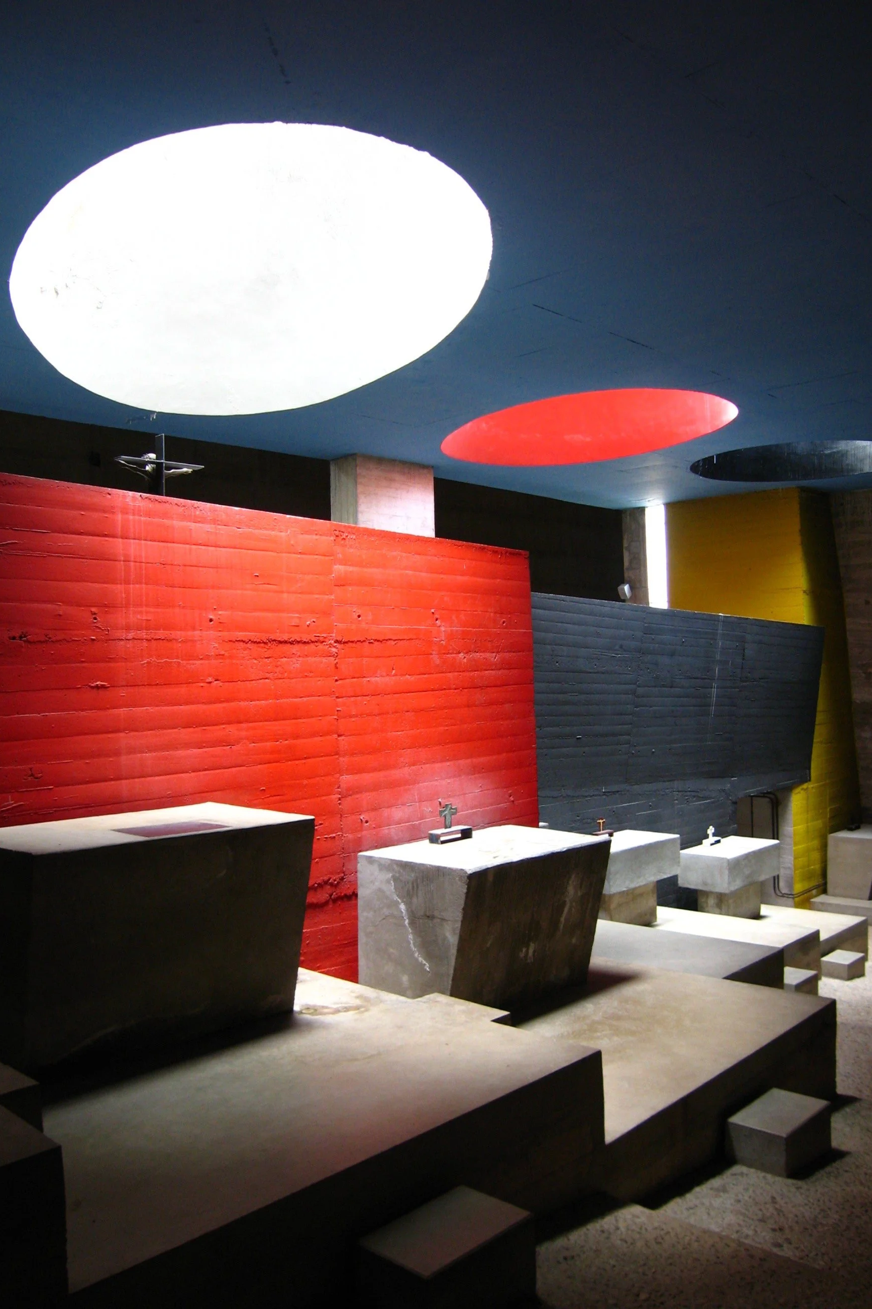
Seeing a new series that Helen had painted specifically for Villa Alba brought me back to an early moment in my training. When I finished my studies, a tutor encouraged me to visit two buildings: Peter Zumthor’s thermal baths at Vals and Le Corbusier’s monastery of La Tourette. I had studied them academically but experiencing them was transformative. I arrived at Vals late at night with no camera, which now feels like a gift. The next morning the building revealed itself slowly. Water tracked across stone. Light was treated almost as a rare commodity, slipping into dark corridors, halls and rooms in a way that amplified its presence. It was architecture understood not through image but through sensation, and it left an impression I have never quite shaken.
La Tourette offered a different lesson. Where Vals felt elemental in form, La Tourette was elemental in ritual and culture. Its concrete frames carved the sun into narrow intervals, dividing time as much as space. Light there was disciplined and structured, almost liturgical. Together, these two buildings taught me that architecture is not only the arrangement of volumes but the shaping of light, proportion and restraint. They formed the early architecture of my thinking long before I knew what my own work might become.
This is why Helen’s paintings struck me so strongly when I first encountered them. They echoed that early experience. They captured the way light misbehaves, how it ignores diagrams and reveals unexpected qualities within the simplest forms. Her work is a study of what happens when form becomes a vessel for atmosphere. In that sense, the paintings feel closer to architecture than to image making. They are a reminder that light is always the true subject.
In our practice, this pursuit of light is shaped by constraint. Every project begins with a site, a family, a budget and a set of competing needs. These limits are not obstacles. They are the conditions through which meaning emerges. Within them lies the opportunity to create spaces that breathe, that register the seasons and the passing of the day. The most poetic moments often occur in the in-between spaces, the corridor, the entry, the stair. These are the places where contrast, shadow and proportion can work quietly and powerfully.
Technology has changed how we communicate this intention. For years, restraint was difficult to show. Clients would look at early renders and search for the design, assuming that simplicity meant incompleteness. As our ability to model the movement of natural and artificial light has improved, we can now show how a room transforms across the day, how material and light work together, how clarity can be more expressive than complexity. Light becomes the organising principle.
During the panel at Otomys, we spoke about this shared territory between painting and architecture. Sitting among Helen’s work, I was reminded that both disciplines are attempts to capture the intangible. Both search for that moment of alignment when form and light settle into equilibrium. In architecture I often think of this as the still point, the moment a project reveals its essence, when proportions start to cohere and the dread of the blank page turns into the excitement of emergence.
This is the pursuit that connects Vals, La Tourette, Helen’s work and our own practice. It is the search for clarity within complexity, for atmosphere within structure, for light as the quiet protagonist. The buildings that shaped me early on taught me that architecture becomes meaningful when it transcends function and enters the realm of experience. Helen’s paintings remind me of this every day.
Related projects:LDS Residence I, RZTK Residence.
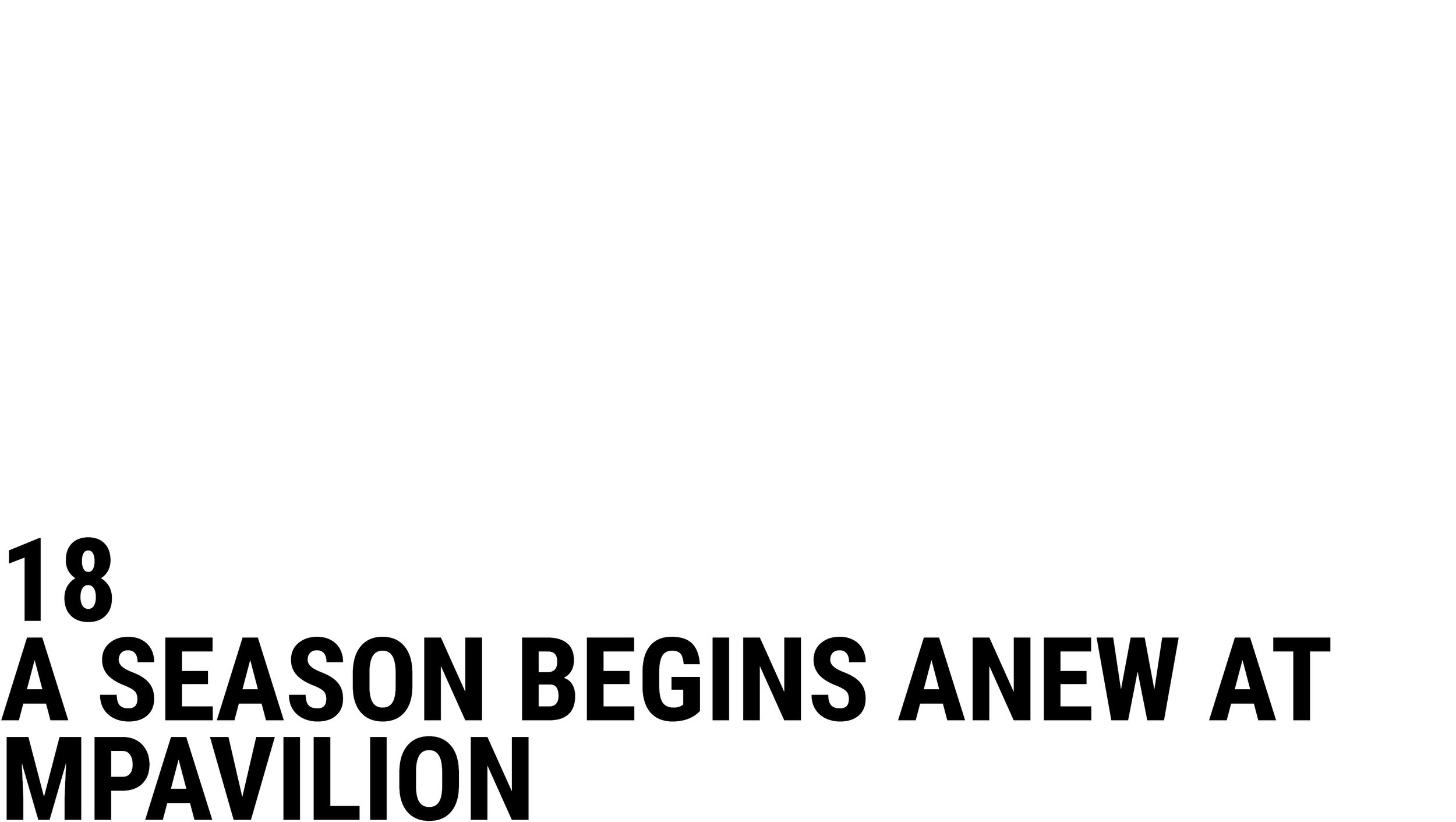
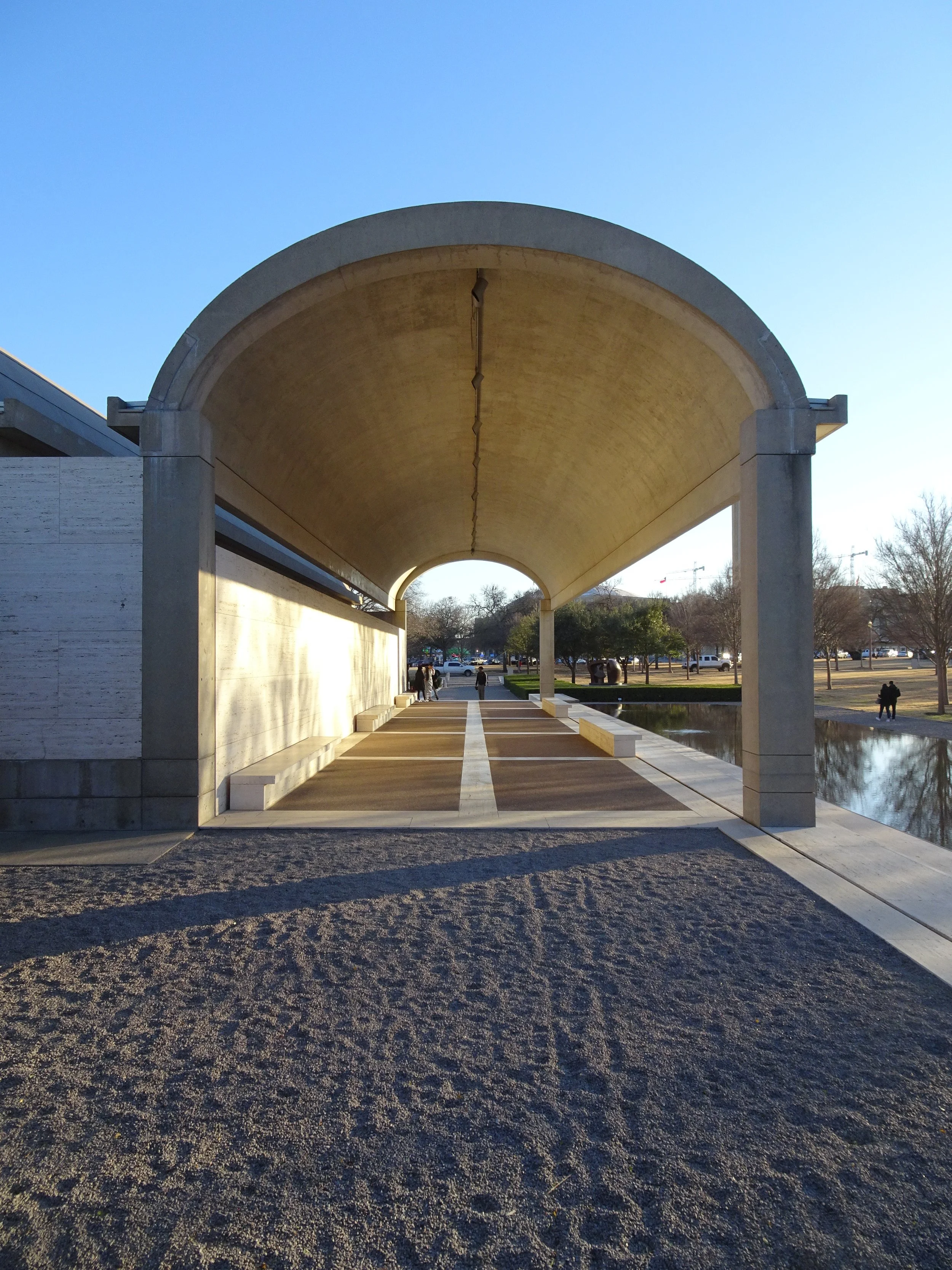
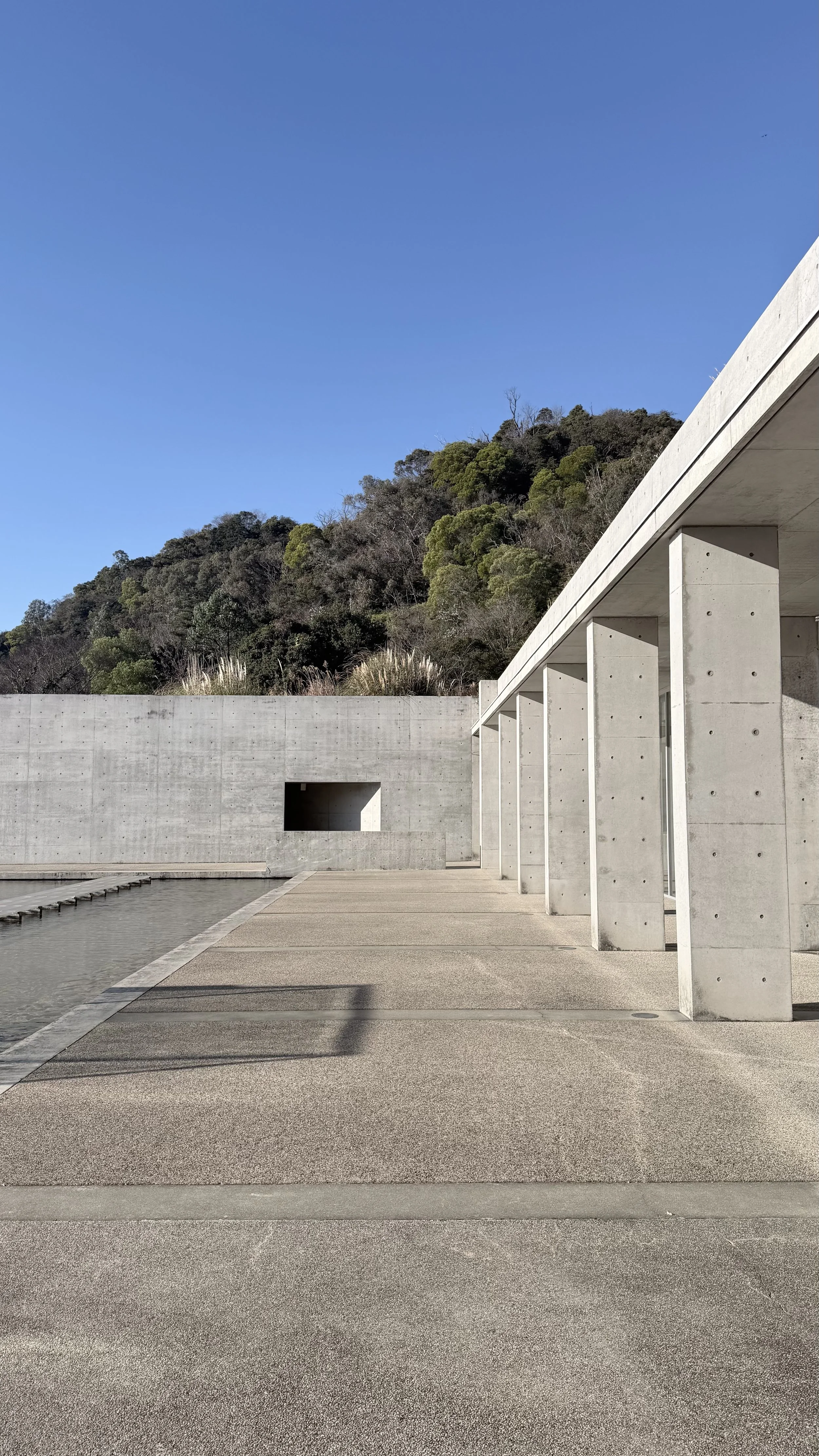
A new season of MPavilion has opened, the third to be held within Tadao Ando’s quiet and exacting contribution to Melbourne. For us at Davidov, the pavilion carries a particular resonance. Circle|Square, the winning chair design we created for the program, has lived within this space for three years now. It has been a privilege to watch people inhabit the pavilion, to watch it reveal itself in different seasons, and to return again and again with a mixture of familiarity and anticipation.

A Season Begins Anew at MPavilion
A new season of MPavilion has opened, the third to be held within Tadao Ando’s quiet and exacting contribution to Melbourne. For us at Davidov, the pavilion carries a particular resonance. Circle|Square, the winning chair design we created for the program, has lived within this space for three years now. It has been a privilege to watch people inhabit the pavilion, to watch it reveal itself in different seasons, and to return again and again with a mixture of familiarity and anticipation.
I have visited this place at many times and in many states. In the brightness of morning when the concrete seems almost weightless. At night when the pond becomes a mirror of the city. On busy afternoons filled with chatter and on quiet days where the air seems to hold the structure still. Yet returning tonight, on a mild spring evening with the sun low and the water pushing its rippled reflections along the concrete walls, the building felt new again. Something had shifted, or perhaps I had. The space carried a clarity that was both unexpected and profound.
As a musical performance unfolded, the architecture insisted on being noticed. The pattern of the spacer bar blanks, deliberate and unwavering, established a rhythm that shaped the atmosphere as much as the sound. The slot window, impossibly thin, impossibly long, impossibly straight, cut a single uncompromising line toward the garden. Through it, the landscape became a curated fragment, a reminder of Ando’s belief that to frame nature is to honour it.
For a pavilion, it offers little in the way of shelter. The breeze moves freely across the water. Rain, when it arrives, is felt as much as seen. Yet this absence of protection is not a deficiency. It is the architectural proposition. The structure defines space with walls, openings, and a singular cylindrical core, but it never fully closes. Instead it choreographs thresholds. It separates paving from pond with the certainty of a diagram, while the surrounding trees and even the skyscrapers seem to lean toward the interior as if curious about what is taking place within.
This is Ando’s restraint at its most distilled. Every line, every surface, every void is doing only what it must and nothing more. The discipline is intense. The effect is calming. The lessons are ongoing.
Each visit to the pavilion reveals yet another insight into how Ando crafts space. And in this new season, as the pavilion begins its next cycle of performances, conversations, and quiet moments, it is an opportunity to be reminded of why architecture matters. More than offering shelter, it is because of its ability to frame the way we view our environment and our place within it.


We speak often about buildings, but rarely about architecture.
We discuss housing supply, heritage overlays, budgets and schedules; the tangible mechanics of building, yet seldom the invisible qualities that truly define it: space, sequence, light, proportion, the way a room opens or holds its breath.

The Missing Conversation
We speak often about buildings, but rarely about architecture.
We discuss housing supply, heritage overlays, budgets and schedules; the tangible mechanics of building, yet seldom the invisible qualities that truly define it: space, sequence, light, proportion, the way a room opens or holds its breath.
This absence says something. Architecture is the most public of the arts, yet it attracts the least conversation. A painting hangs in a gallery; a building frames our lives. We walk through it, rely on it, inherit it. And still, we seldom pause to talk about what it means - what it does to us. Perhaps we take it for granted. Or perhaps, as with many of the arts, it has been gently side-lined, replaced by conversations about efficiency, cost and compliance.
But architecture is a barometer of culture. It records what a people value - its priorities, its aspirations, its spirit. Every era leaves a spatial trace of itself. When a culture stops talking about architecture, it stops asking what kind of world it wishes to inhabit.
Too often, the conversation that remains is about size and status - how large a house is, how many bedrooms or bathrooms it holds, how many Instagram-able moments it contains. We talk about finishes, not light; inclusions, not atmosphere. Yet these metrics say nothing of how a home actually performs - how it feels, how it breathes, how it shelters. The absence of this deeper dialogue has reduced architecture to inventory, when its real measure has always been experience.
Louis Kahn once said, “A great building must begin with the unmeasurable, must go through measurable means when it is being designed, and in the end must be unmeasured.” In his work, walls hold light as if in conversation - silence made visible. His buildings remind us that architecture is not just about function but about dignity, about giving shape to human experience. To talk about architecture, then, is to talk about time itself: how we live within it.
This is not to romanticise the discipline or ignore its practical demands. Architecture will always be tethered to construction and cost, to regulation and delivery. But the conversation could afford to reach further - to speak of atmosphere, material, and meaning. To ask not only what we build, but what we are aiming to create beyond the mere brief.
The loss of that conversation is not only to architecture’s detriment; it is everyone’s. When discussion narrows to procurement and façade, imagination is limited and numbed. We begin to see buildings merely as commodities. Yet architecture at its core is about achieving more, more than the brief, more than compliance, more efficiency, more GFA. How do you add delight, intent, craft and care? How do you make a space worthy?
Perhaps architecture’s quietness has worked against it. Unlike theatre, music, or film, it doesn’t demand our attention all at once. It often reveals itself slowly, across seasons, through occupation and use. But that slowness is also its gift. It asks us to notice - to tune our senses to the way light falls on a wall, or how a threshold shifts the mood of a room. In a world increasingly distracted, architecture’s patience might be its most radical quality.
To revive the conversation is not to intellectualise the everyday, but to reawaken curiosity. To ask: how does this space make me feel? What does it allow? What does it deny? These questions belong to everyone, not just architects.
If art can stir emotion, if music can bind memory, then architecture can ground us. It can lend coherence to our daily rituals, shape our sense of belonging, and quietly mirror who we are.
Perhaps, then, the missing conversation is less about architecture itself, and more about us, about what we choose to notice, to value, and to build.

Among all the spaces that make up a home, the entry is perhaps the most overlooked. It rarely appears in a client’s briefing document. Yet it is the first and last moment of every visit, the space that negotiates between the world outside and the life within.

The Entry
Among all the spaces that make up a home, the entry is perhaps the most overlooked. It rarely appears in a client’s briefing document. Yet it is the first and last moment of every visit, the space that negotiates between the world outside and the life within.
When we begin to plan a home, the location and composition of the entry are critical. In this small zone, many different performances unfold: waiting for the door in the rain, greeting a group of guests, lingering for farewells and doorway conversations, slipping on shoes, or presenting flowers and a bottle of wine. The entry is a small stage - sometimes with a cast of many, often with only one actor - where architecture must quietly manage light, movement, and mood.
From a planning perspective, we look to accommodate not just the ergonomics of these rituals but the emotion that accompanies them. The entry should offer shelter and privacy, a moment of pause that smooths the transition from public to private life. It must be practical yet ceremonial, allowing for everyday comings and goings while still holding a sense of grace. A light that spills across the threshold, a covered step, the sound of a door closing softly - all these small gestures signal welcome and belonging.
Architecturally, the entry is both a space for standing and a space for passing through. It holds stillness and movement at once. We often draw on Frank Lloyd Wright’s idea of compression and release - a sequence that moves from dark to light, from narrow to open. This rhythm creates intimacy and drama in quick succession, preparing the body and the mind for what lies beyond.
A well-designed entry is not simply an access point but an emotional calibration, a first act that sets the tone for the rest of the home.
In several recent projects, we have explored how the entry can also test the boundaries between inside and out. By manipulating light, enclosure, and view, the threshold becomes ambiguous - part garden, part room. Screens, courtyards, and overhangs allow the space to breathe, extending the welcome before one even crosses the door. In this way, the entry continues the conversation we began with the courtyard: both are transitional territories that invite a slower rhythm of arrival and departure.
At its best, the entry performs two tasks simultaneously. It must function with absolute clarity - logical, sheltered, effortless - yet it should also evoke emotion, creating the briefest moment of theatre in the everyday act of coming home. For all its modest size, the entry remains a deeply human space, one that reminds us that architecture begins not with walls, but with thresholds.
Related projects:EPSC Residence, RZTK Residence, LDS Residence I.


During my childhood my family and I moved often.
There was a ritual I learned to resist. I would open drawers, repack small things I had not used since unpacking, then carry them to the next address for the process to be repeated. It was a feeling that made me feel weighed down, inefficient and burdened.

The Carry List
During my childhood my family and I moved often.
There was a ritual I learned to resist. I would open drawers, repack small things I had not used since unpacking, then carry them to the next address for the process to be repeated. It was a feeling that made me feel weighed down, inefficient and burdened.
Inadvertently each move taught me two important lessons, firstly to travel lighter and be conscious about what you acquire, secondly to learn to let go and not fear the act. Of course, learning this as a child when debating comic books or toys is easier than decisions on furniture or art - but the discipline was ingrained.
After completing my architectural studies in 2007 I backpacked around the world for nine months. I still clearly recall meeting a traveller somewhere in Croatia - he was travelling for a few weeks carrying only a small rucksack and a neat box that held a phone, a camera and a few essentials. My own pack, already bulging, felt excessive by comparison. That freedom and lightness he demonstrated have guided me for two decades, whether on the road or at home.
I was tested a year ago. My mother handed me 3 boxes she had been holding since I moved out and no longer wanted to be responsible for them. They contained all kinds of paper work and knickknacks, my report card, invitations, newspapers from the day I was born, and a favourite teddy. As I sifted through the boxes examining each object I asked - If I kept these relics, who were they for and what would they serve? I let them all go. Reflecting back a year later I feel light and liberated. You don't have to be tied to things, nor cluttered by them.
Yes your home is a container for your life - but what do you want it to contain? The spaces we form and curate around us are more than their contents, often it’s the absence that makes way for the freedom we are hoping to possess.


Architecture and the interiors it holds are inseparable. The most compelling work reads as one thought carried through many scales, from the composition of the plan to the turn of a handle.


On the Gesamtkunstwerk
Architecture and the interiors it holds are inseparable. The most compelling work reads as one thought carried through many scales, from the composition of the plan to the turn of a handle.
The idea is ancient, but it found its distilled form in the modern tradition of the Gesamtkunstwerk: the total work of art came into vogue in the late nineteenth century. To invoke it today is not a call for excess or control, but for coherence. A building should feel inevitable, as though plan, section, detail and furnishing were all born of the same language, the same hand.
In practice, this means working from the outside in and the inside out at once. Site, climate and program set the first conditions. From there, form and threshold establish how the building meets light and landscape. Grammar and punctuation follow: the structure’s expression, the significance of a junction, the invitation of shadow, the dialogue between materials.
At the interior scale, the same language is held. Materials are restrained so each becomes essential. Details repeat so the eye can rest and the hand can predict. A stair set into a slab, the return of a cabinet, the turn of a rail, all carry the same consistency of thought. With this foundation in place, loose pieces can enter freely and with confidence.
Furniture, lighting and art are not always part of the commission, but increasingly they become part of the process. Clients often invite us to help assemble collections or design key pieces that complete the rooms. Recent travels, including Milan Design Week and the development of our own furniture, have sharpened that focus. We are drawn to pieces that work harder than they look, that hold material truth, and that continue the architectural conversation across scales.
Our pursuit is not the totalising ideal of a century ago. Life resists perfect control, as it should. The ambition is quieter: to hold a clear vision across scales so that a house feels calm, legible and incomplete in a way that allows for change and evolution over time. Architecture that sets the tone. Interiors that resonate with it. Objects that belong, enhance, and allow life to unfold.
Related projects:EPSC Residence, LDS Residence I.


Heidi Museum of Modern Art

Last month I had the privilege of speaking at the IID’s annual conference, hosted at Tollmans. My sincere thanks to the IID for the opportunity, and to Tal Goldsmith Fish for the kind invitation.

Reflecting on Australian Modernism
Last month I had the privilege of speaking at the IID’s annual conference, hosted at Tollmans. My sincere thanks to the IID for the opportunity, and to Tal Goldsmith Fish for the kind invitation.
In preparing for the talk, Tal suggested that the audience might enjoy case studies of Australian homes. That prompt led me to revisit our work of the past decade through the lens of Australian Modernism; a theme that has long shaped how we design.
Alongside our own projects, I highlighted works that have been enduring influences, including Harry Seidler’s Killara House and McGlashan Everist’s Heide II. Taking the time to reflect on these precedents, and on the homes we have designed both on the Mornington Peninsula and in more urban settings, was a welcome gift.
What struck me most came after the talk, in conversation with colleagues. I was surprised; in the best possible way, to hear how distinct our work appeared when seen alongside that of our Israeli counterparts. In a world that feels more globalised every day, realising that our architecture continues to carry a clear sense of regional identity was rewarding in itself. It reminded me that architecture is always a dialogue between the universal and the local: informed by global discourse, yet grounded in the particularities of place, culture, and climate. For us, that means embracing the material honesty, spatial clarity, and connection to landscape that have long defined Australian Modernism, while continuing to evolve these qualities for contemporary living. To see that identity recognised by peers from another part of the world was both affirming and inspiring.

We were recently interviewed by Jonathan Jacobs on the Behind the Build podcast and prompted to reflect on our approach to architecture. The conversation touched on familiar themes in our work: pared-back forms, warm natural tones, texture, and a restrained execution. While summarising, I found myself saying, almost instinctively, “we prefer a cave to a computer.”

A Cave not a Computer
We were recently interviewed by Jonathan Jacobs on the Behind the Build podcast and prompted to reflect on our approach to architecture. The conversation touched on familiar themes in our work: pared-back forms, warm natural tones, texture, and a restrained execution. While summarising, I found myself saying, almost instinctively, “we prefer a cave to a computer.”
In many ways, that phrase captures much of what drives us. Architecture, at its best, is a place of refuge and escape. It is an antidote to the pace and pressure of contemporary life. Increasingly, we see our role as creating environments that stand apart from the digital world - not in opposition to technology, but as an intentional counterbalance to it.
The metaphor of the cave is not about darkness or retreat, but about depth, protection, and calm. It is a reminder that spaces should shelter, soften, and restore. In contrast, the “computer” suggests efficiency, speed, and constant connectivity - qualities that are necessary in many areas of life, but not the ones we believe should define the home.
Our mission, in an era of AI integration and ever-present screens, is to design spaces that allow for disconnection. We conceal technology where possible, integrate it discreetly where necessary, and give primacy to the tactile and the timeless. Render, stone, timber, and light form the architecture, not the devices that inhabit it.
Call me a hermit, but I will always retreat to the cave. For us, the enduring value of architecture lies in creating environments that nourish, restore, and endure - places where life can unfold freely, away from the glow of the screen.
When I am in Tel Aviv, it is hard not to be seduced by the architectural heritage of the White City ; a collection of some 4,000 buildings constructed from the 1930s onwards, now recognised by UNESCO as the world’s largest concentration of Bauhaus and International Style architecture.


The White City of Tel Aviv
When I am in Tel Aviv, it is hard not to be seduced by the architectural heritage of the White City ; a collection of some 4,000 buildings constructed from the 1930s onwards, now recognised by UNESCO as the world’s largest concentration of Bauhaus and International Style architecture.
Many of these buildings stand in various states of disrepair. Yet their essence remains striking: the clean horizontality of cantilevered balconies, the narrow “thermometer” windows, the geometric massing and flat roofs. These elements, originally transplanted from Europe and adapted for a Mediterranean climate, have weathered a century of sun, salt, and use. They inspire not only through their original forms, but through the patina of daily life and the countless adaptations that have allowed them to continue serving the dense urban fabric at the heart of the city.
Walking the streets, there is always another discovery. A brise-soleil screen casting delicate shadows, a balustrade with a handmade curve, or a terrazzo pattern worn smooth underfoot. Each detail tells a story of modernism translated into lived experience, shaped as much by residents as by architects. The White City is less a static museum of modernism than a living canvas, where buildings evolve organically with time.


Beyond the Bauhaus legacy, older parts of Tel Aviv reveal a rich layering of styles. Eclectic architecture from the city’s early decades; a blend of European, Middle Eastern, and Art Deco motifs, is now being carefully restored, bringing back a vibrancy that speaks of cosmopolitan beginnings. Just as compelling is Tel Aviv’s remarkable collection of brutalist buildings, many of which rise in unapologetic contrast to the refined modernism of the White City. Together, these overlapping styles form a complex architectural identity that is both regional and international.
To walk through Tel Aviv is to understand how architecture has shaped not only the city’s fabric but also its spirit. The White City, together with the Eclectic and Brutalist layers that sit alongside it, reflects a vision that has continually fuelled the dynamism of Ir L’lo Hafsaka, the city that never stops. Here, the work of architects over generations has contributed to a vitality that feels both historic and immediate, making Tel Aviv a place where architecture and life are inseparable.


